
A deep dive on ARIMA models
#python #statisticsWritten by Matt Sosna on August 11, 2021
Predicting the future has forever been a universal challenge, from decisions like whether to plant crops now or next week, marry someone or remain single, sell a stock or hold, or go to college or play music full time. We will never be able to perfectly predict the future[1], but we can use tools from the statistical field of forecasting to better understand what lies ahead.
Forecasting involves time series data, or repeated measures over time. In data such as hourly temperature, daily electricity consumption, or annual global population estimates, we can look for patterns that collapse those hundreds or thousands of numbers down to a few defining characteristics. We can use time series analysis to quantify the rate at which the values are trending upward or downward, measure how much one value is correlated with the previous few, decompose our data into its underlying repeating cycles, and more.
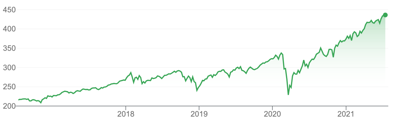 S&P 500 daily prices over the last five years, an example of a highly-studied time series. Screenshot from Google Finance.
To summarize a time series and predict its future, we need to model the relationship the values in the time series have with one another. Does today tend to be similar to yesterday, a week ago, or last year? How much do factors outside the time series, such as noise or other time series, play a role?
To answer these questions, we’ll start with a basic forecasting model and iterate towards a full autoregressive moving average (ARMA) model. We’ll then take it a step further to include integrated, seasonal, and exogeneous components, expanding into a SARIMAX model.
In other words, we’ll build from this:
\[y_t = c + \epsilon_t\]to this:
\[\color{orangered}{d_t} = c + \color{royalblue}{\sum_{n=1}^{p}\alpha_nd_{t-n}} + \color{darkorchid}{\sum_{n=1}^{q}\theta_n\epsilon_{t-n}} + \color{green}{\sum_{n=1}^{r}\beta_nx_{n_t}} + \color{orange}{\sum_{n=1}^{P}\phi_nd_{t-sn}} + \color{orange}{\sum_{n=1}^{Q}\eta_n\epsilon_{t-sn}} + \epsilon_t\]It looks complicated, but each of these pieces $-$ the autoregressive, moving average, exogeneous, and seasonal components $-$ are just added together. We can easily tune up or down the complexity of our model by adding or removing terms, and switching between raw and differenced data, to create ARMA, SARIMA, ARX, etc. models.
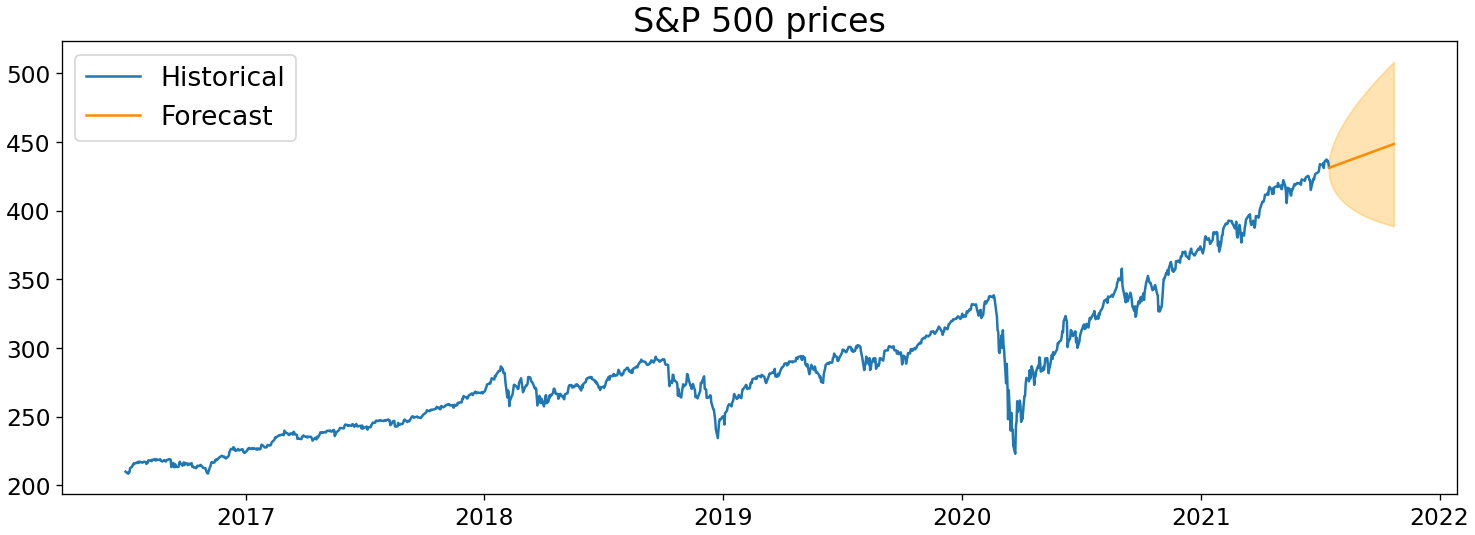
Once we’ve built a model, we’ll be able to predict the future of a time series like below. But perhaps more importantly, we’ll also understand the underlying patterns that give rise to our time series.
(Obligatory note: this post does not constitute investment advice; all examples are just for illustrative purposes.)
Table of contents
- Getting started
- AR: Autoregression
- MA: Moving average
- Putting it together
- Additional components
- Time series in Python
Getting started
Autocorrelation
Before we can start building any models, we need to cover a topic essential for describing time series: autocorrelation. Autocorrelation means “self-correlation”: it is the similarity of a time series’ values with earlier values, or lags. If our time series was the values [5, 10, 15], for example, our lag-1 autocorrelation would be the correlation of [10, 15] with [5, 10].
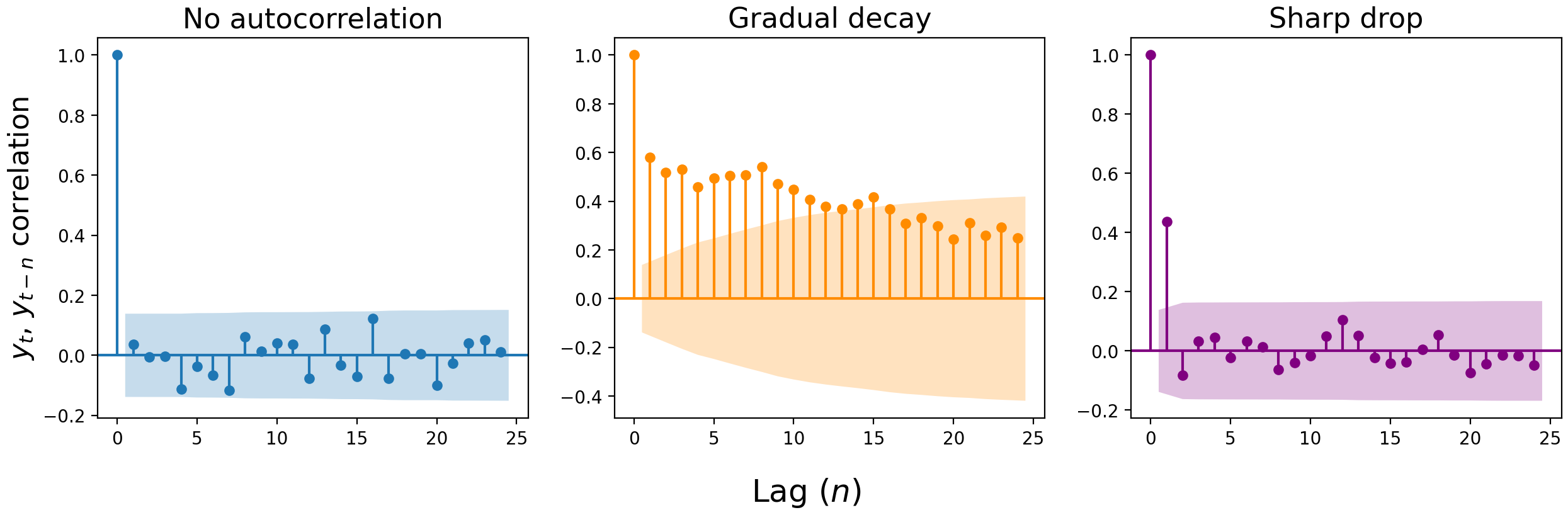
We can visualize the correlation of the present value with a previous value $n$ lags ago with an autocorrelation plot. These plots are constructed by calculating the correlation of each value ($y_t$) with the value at the previous time step ($y_{t-1}$), two steps ago ($y_{t-2}$), three ($y_{t-3}$), and so on. The y-axis shows the strength of correlation at lag $n$, and we consider any value outside the shaded error interval to be a significant correlation.
The correlation at lag zero is always 1: $y_t$ better be perfectly correlated with $y_t$, or something’s wrong. For the remaining lags, there are three typical patterns: 1) a lack of autocorrelation, 2) a gradual decay, and 3) a sharp drop. (Though in real-world data, you might get a mix of #2 and #3.)
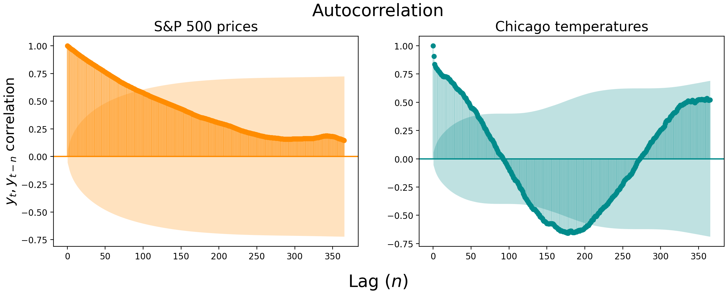
Below we visualize the autocorrelation of daily S&P 500 closing prices (left) and daily maximum temperature at the Chicago Botanical Garden (right). The S&P 500 prices are so correlated that you have to look more than three months into the past to find uncorrelated values. The Chicago temperatures become uncorrelated faster, at about the two month mark, but then shoot out the other side and become negatively correlated with temperatures from 4-7 months ago.
Partial autocorrelation
Autocorrelation plots are useful, but there can be substantial correlation “spillover” between lags. In the S&P 500 prices, for example, the lag-1 correlation is an astonishing 0.994 $-$ it’s hard to get a good read on the following lags with the first lag indirectly affecting all downstream correlations.
This is where partial autocorrelation can be a useful measure. Partial autocorrelation is the correlation of $y_t$ and $y_{t-n}$, controlling for the autocorrelation at earlier lags.
Let’s say we want to measure the lag-2 autocorrelation without the lag-1 spillover. Rather than directly measure the correlation of $y_t$ and $y_{t-2}$, we’d fit a linear regression of $y_t \sim \beta_0 + \beta_1y_{t-1}$, a regression of $y_{t-2} \sim \beta_0 + \beta_1y_{t-1}$, and then find the correlation between the residuals of these two regressions.
The residuals quantify the amount of variation in $y_t$ and $y_{t-2}$ that cannot be explained by $y_{t-1}$, granting us an unbiased look at the relationship between $y_t$ and $y_{t-2}$. We can then repeat this process, measuring the correlation between the residuals of regressions on lags up to $n$, to find the partial autocorrelation for lag $n$. We’d measure the partial autocorrelation at lag-3, for example, by regressing the residuals of $y_t \sim \beta_0 + \beta_1y_{t-1} + \beta_2y_{t-2}$ against the residuals of $y_{t-3} \sim \beta_0 + \beta_1y_{t-1} + \beta_2y_{t-2}$.
Here’s how the partial autocorrelation plots look for the S&P 500 prices and Chicago temperatures. Notice how the lag-1 autocorrelation remains highly significant, but the following lags dive off a cliff.
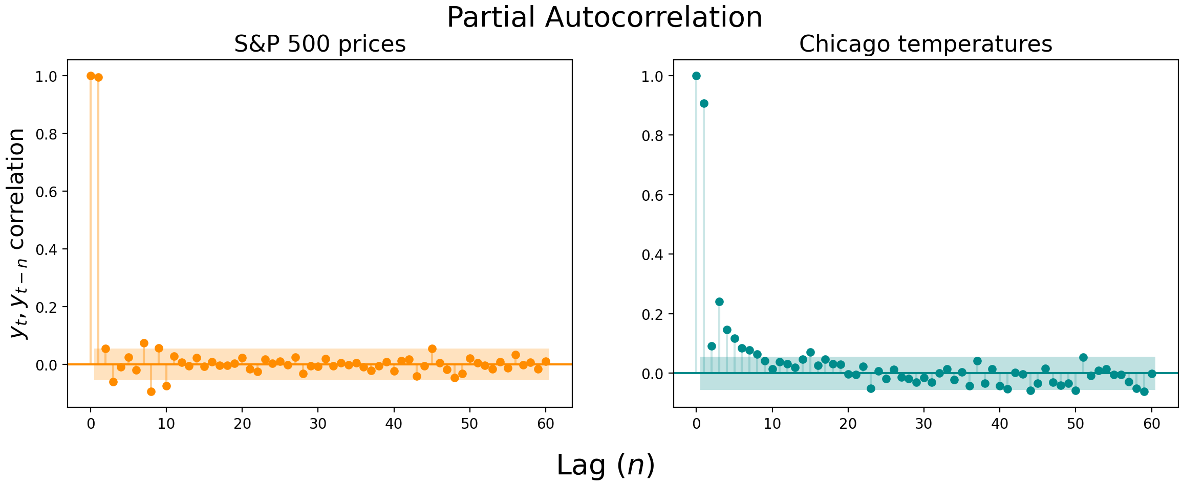
Autocorrelation and partial autocorrelation plots can be used to determine whether a simple AR or MA model (as opposed to full ARIMA model) is sufficient to describe your data[2], but you probably won’t use them this way. In the fifty years since autocorrelation plots were first introduced, your laptop has likely become strong enough to perform a brute force scan to find the parameters for the ARIMA (or even SARIMAX) model that best describes your data, even if there are thousands of observations. These plots, then, are probably more useful as complementary ways of visualizing the temporal dependence of your data.
Stationarity
As with any statistical model, there are assumptions that must be met when forecasting time series data. The biggest assumption is that the time series is stationary. In other words, we assume that the parameters that describe the time series aren’t changing over time. No matter where on the time series you look, you should see the same mean, variance, and autocorrelation.[3]
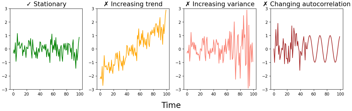
This doesn’t mean we can only forecast time series that look like the green jumbled mess above. While most real-world time series aren’t stationary, we can transform a time series into one that is stationary, generate forecasts on the stationary data, then un-transform the forecast to get the real-world values. Some common transformations include differencing (and then possibly differencing again), taking the logarithm or square root of the data, or taking the percent change.
Transformations are necessary because linear models require that the data they model be independent and identically likely to be drawn from the parent population. This isn’t the case with time series data $-$ any autocorrelation at all immediately violates the independence assumption. But many of the conveniences of independent random variables $-$ such as the law of large numbers and the central limit theorem $-$ also hold for stationary time series. Making a time series stationary is therefore a critical step in being able to model our data.
AR: Autoregression
With some basics behind us, let’s start building towards our ARIMA model. We’ll start with the AR, or autoregressive component, then later add in the moving average and integrated pieces.
AR(0): White noise
The simplest model we can build is one with no terms. Well, almost. There’s just a constant and an error term.
\[y_t = c + \epsilon_t\]This kind of time series is called white noise. $\epsilon_t$ is a random value drawn from a normal distribution with mean 0 and variance $\sigma^2$.[4] Each value is drawn independently, meaning $\epsilon_t$ has no correlation with $\epsilon_{t-1}$, $\epsilon_{t+1}$, or any other $\epsilon_{t \pm n}$. Written mathematically, we would say:
\[\epsilon_t \overset{iid}{\sim} \mathcal{N}(0, \sigma^2)\]Because all $\epsilon_t$ values are independent, the time series described by the model $y_t = \epsilon_t$ is just a sequence of random numbers that cannot be predicted. Your best guess for the next value is $c$, since the expected value of $\epsilon_t$ is zero.
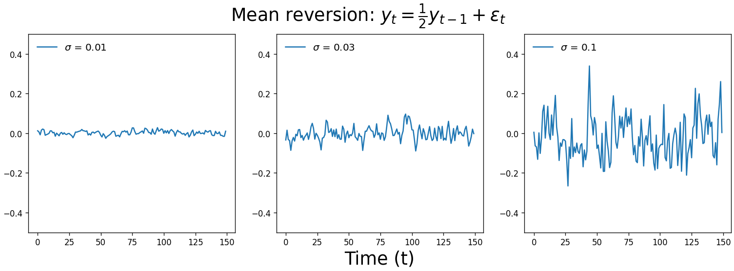
Below are three white noise time series drawn from normal distributions with increasing standard deviation. $c$ is zero and is therefore omitted from the equation.
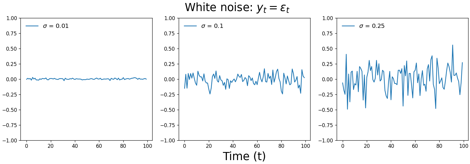
A time series of random values we can’t forecast is actually a useful tool to have. It’s an important null hypothesis for our analyses $-$ is there a pattern in the data that’s sufficiently strong to distinguish the series from white noise? Our eyes love finding patterns $-$ even when none actually exist $-$ so a white noise comparison can protect against false positives.
White noise is also useful for determining whether our model is capturing all the signal it can get from our time series. If the residuals of our forecasts aren’t white noise, our model is overlooking a pattern that it could use to generate more accurate predictions.
AR(1): Random walks and oscillations
Let’s start adding autoregressive terms to our model. These terms will be lagged values of our time series, multiplied by coefficients that best translate those previous values into our current value.
In an AR(1) model, we predict the current time step, $y_t$, by taking our constant $c$, adding the previous time step $y_{t-1}$ adjusted by a multiplier $\alpha_1$, and then adding white noise, $\epsilon_t$.
\[y_t = c + \alpha_1y_{t-1} + \epsilon_t\]The value of $\alpha_1$ plays a defining role in what our time series looks like. If $\alpha_1 = 1$, we get a random walk. Unlike white noise, our time series is free to wander away from its origin. Random walks are an incredibly useful model for stochastic processes across many applications, such as modeling the movement of particles through a fluid, the search path of a foraging animal, or changes in stock prices.
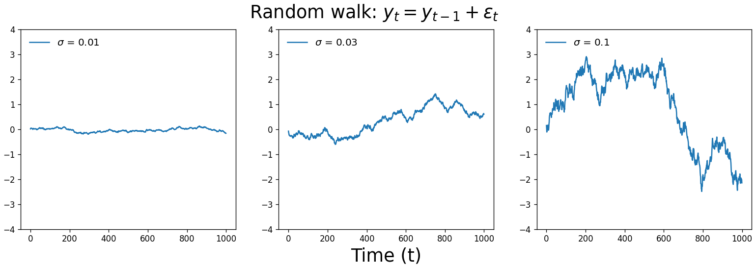
So when $\alpha_1$ = 0, we get white noise, and when $\alpha_1$ = 1, we get a random walk. When $0 < \alpha_1 < 1$, our time series exhibits mean reversion. It’s subtle, but you’ll notice that the values are correlated with one another and they tend to hover around zero, like less chaotic white noise. A real-world example of this process is large changes in stock prices: sudden shifts tend to be followed by mean reversion.
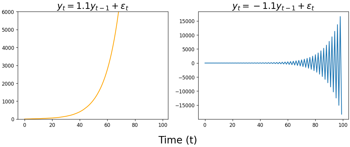
When fitting an AR model, statistics packages typically constrain the $\alpha$ parameter space to $-1 \leq \alpha \leq 1$ when performing maximum likelihood estimation. Unless you’re modeling exponential growth or sharp oscillations, the time series described by these models are probably not what you’re looking for.
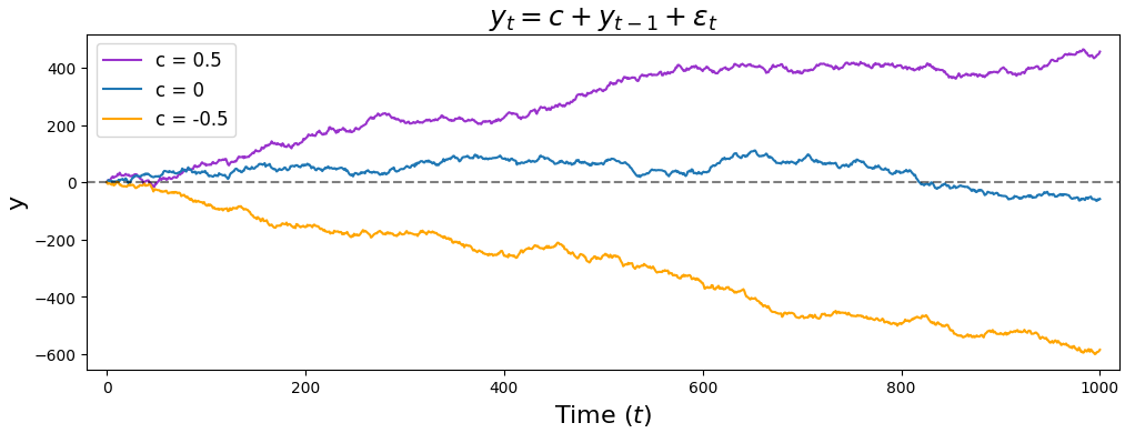
Finally, our interpretation of $c$ changes with an AR(1) model. In an AR(0) model, $c$ corresponded to where our time series was centered. But since an AR(1) model takes into account $y_{t-1}$, $c$ now represents a rate at which our time series trends upward (if $c > 0$) or downward (if $c < 0$).
AR(p): Higher-order terms
Adding more lags to our model is just a matter of adding $\alpha_n y_{t-n}$ terms. Here’s what an AR(2) model looks like, with the additional term highlighted in blue.
\[y_t = c + \alpha_1y_{t-1} + \color{royalblue}{\mathbf{\alpha_2y_{t-2}}} + \epsilon_t\]This says that the value at our current time step $y_t$ is determined by our constant $c$, plus the value at the previous time step $y_{t-1}$ multiplied by some number $\alpha_1$, plus the value two time steps ago $y_{t-2}$ multiplied by another number $\alpha_2$, plus a white noise value $\epsilon_t$. To fit this type of model, we now estimate values for both $\alpha_1$ and $\alpha_2$.
As we add more lags to our model, or we start including moving average, exogeneous, or seasonal terms, it will become useful to rewrite our autoregressive terms as a summation. (Statisticians also use backshift notation, but we’ll stick with summations to avoid that learning curve.) Here’s the general form for an AR(p) model, where $p$ is the number of lags.
\[y_t = c + \sum_{n=1}^{p} \alpha_ny_{t-n} + \epsilon_t\]The above equation simply says “our current value $y_t$ equals our constant $c$, plus every lag $y_{t-n}$ multiplied by its coefficient $\alpha_n$, plus $\epsilon_t$.” We can use the same equation regardless of whether $p$ is 1 or 100… though if your model has 100 lags, you might want to look into including the next term we’ll describe: the moving average.
MA: Moving average
The second major component of an ARIMA model is the moving average component. This component is not a rolling average, but rather the lags in the white noise.
The $\epsilon_t$ term, previously some forgettable noise we add to our forecast, now takes center stage. In an MA(1) model, our forecast for $y_t$ is our constant plus the previous white noise term $\epsilon_{t-1}$ with a multiplier $\theta_1$, plus the current white noise term $\epsilon_t$.
\[y_t = c + \theta_1\epsilon_{t-1} + \epsilon_t\]As before, we can concisely describe an MA(q) model with this summation:
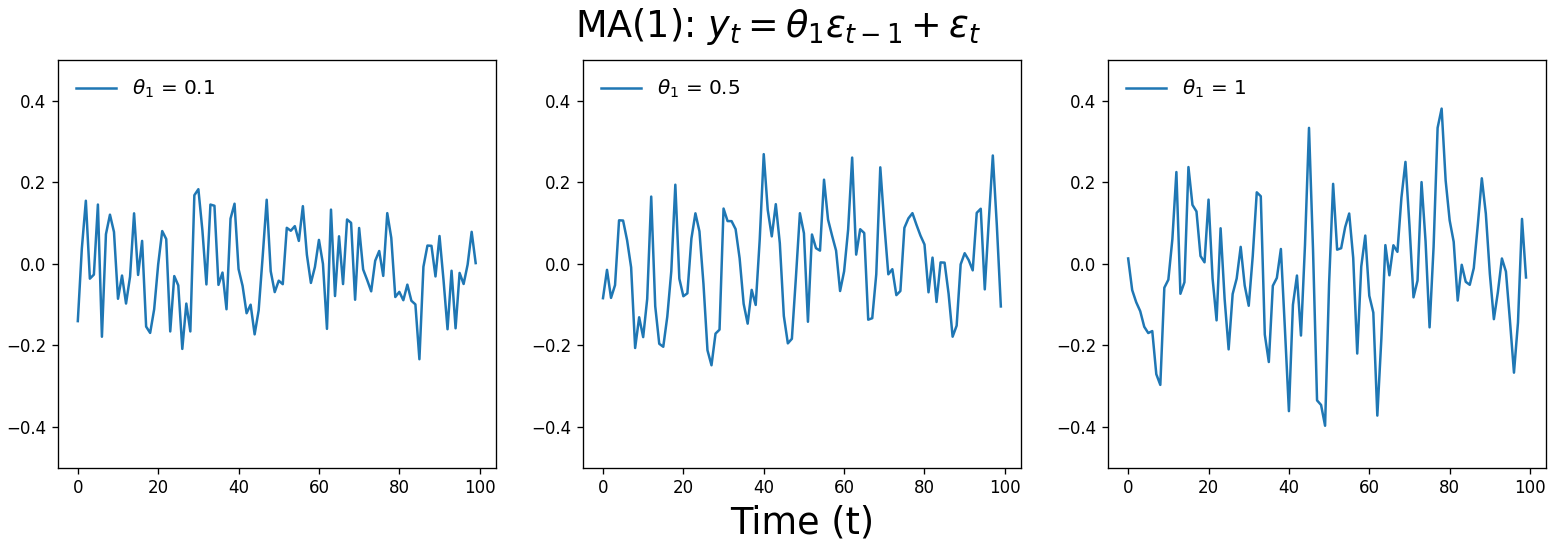
\[y_t = c + \sum_{n=1}^{q}\theta_n\epsilon_{t-n} + \epsilon_t\]Here are three MA(1) time series that vary in the value of $\theta_1$, the multiplier on $\epsilon_{t-1}$. Don’t feel bad if you don’t experience an “ah-ha” moment looking at these; they should look fairly similar to white noise.
Moving average processes are a lot less intuitive than autoregression $-$ what time series has no memory of its past behavior, but remembers it previous random noise? Yet a surprising number of real-world time series are moving average processes, from misalignment of store goods and sales, battery purchases in response to natural disasters, and low-pass filters such as the treble knobs on car stereos.
Here’s a silly but helpful misalignment example from YouTuber ritvikmath. Imagine a recurring party where you’re assigned to provide one cupcake per guest. $y_t$ is the correct number of cupcakes to bring. You’re expecting roughly 10 people, so you start by bringing 10 cupcakes ($c=10$). When you arrive, you note how many cupcakes you over- or under-supplied ($\epsilon_t$).
For the following meeting, you bring 10 cupcakes adjusted by that difference from the previous meeting (now $\epsilon_{t-1}$) multiplied by some factor ($\theta_1$). You want to bring the negative of the number of cupcakes you were off by last time, so you set $\theta_1=-1$. If you were two short last time ($\epsilon_{t-1}=-2$), for example, you’d bring two extra.
The number of guests who show up is essentially random, but the guests remember the number of cupcakes at the previous meeting $-$ if there were too many, more guests will show up, and if there were too few, then fewer guests will come.
We can therefore model the correct number of cupcakes at each meeting like below. The blue terms are the number of cupcakes you bring to the meeting, and the orange is the difference between the number we bring and the number of people who show up.
\[y_t = \color{royalblue}{10 - \epsilon_{t-1}} + \color{orange}{\epsilon_t}\]The thing to note here is that this time series doesn’t care about its own history (the correct number of cupcakes); it is only affected by external random noise that is remembered for a brief period (the difference between the number of cupcakes and the number of party attendees). This is therefore a moving average process.
 Photo by Brooke Lark on Unsplash
Putting it together
Having covered AR and MA processes, we have all we need to build ARMA and ARIMA models. As you’ll see, these more complex models simply consist of AR and MA components added together.
ARMA: Autoregressive moving average
While many time series can be boiled down to a pure autoregressive or pure moving average process, you often need to combine AR and MA components to successfully describe your data. These ARMA processes can be modeled with the following equation:
\[y_t = c + \sum_{n=1}^{p}\alpha_ny_{t-n} + \sum_{n=1}^{q}\theta_n\epsilon_{t-n} + \epsilon_t\]The ARMA equation simply states that the value at the current time step is a constant plus the sum of the autoregressive lags and their multipliers, plus the sum of the moving average lags and their multipliers, plus some white noise. This equation is the basis for a wide range of applications, from modeling wind speed, forecasting financial returns, and even filtering images.
Below are four ARMA(1,1) time series. As with the MA(1) plot above, it’s difficult to look at any of the time series below and intuit the parameter values, or even that they’re ARMA processes rather than AR or MA alone. We’re at the point where our time series have become too complex to intuit the type of model or its parameters from eyeballing the raw data.
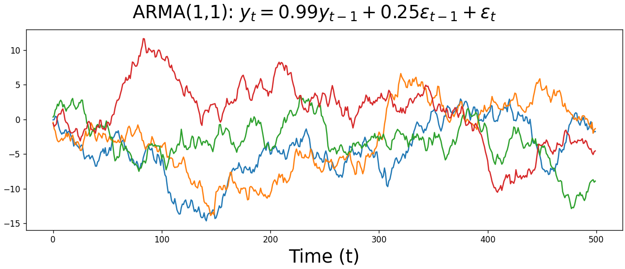
But that’s ok. Moving forward, we’ll start using AIC to determine which model best describes our data, whether that’s an AR, MA, or ARMA model, as well as the optimal number of lags for each component. We’ll cover this process at the end of this post, but in the meantime let’s cover the remaining pieces of the SARIMAX model.
ARIMA: Autoregressive integrated moving average
We’ve arrived at the namesake of this blog post: the ARIMA model. Despite the buildup, we’ll actually see that an ARIMA model is just an ARMA model, with a preprocessing step handled by the model rather than the user.
Let’s start with the equation for an ARIMA(1,1,0) model. The (1,1,0) means that we have one autoregressive lag, we difference our data once, and we have no moving average terms.
\[\color{red}{y_t - y_{t-1}} = c + \alpha_1(\color{red}{y_{t-1} - y_{t-2}}) + \epsilon_t\]Notice how we’ve gone from modeling $y_t$ to modeling the change between $y_t$ and $y_{t-1}$. As such, our autoregressive term, previously $\alpha_1y_{t-1}$, is now $\alpha_1(y_{t-1}-y_{t-2})$.
In other words, an ARIMA model is simply an ARMA model on the differenced time series. That’s it! If we replace $y_t$ with $d_t$, representing our differenced data, then we simply have the ARMA equation again.
\[\color{red}{d_t} = c + \sum_{n=1}^{p}\alpha_n\color{red}{d_{t-n}} + \sum_{n=1}^{q}\theta_n\epsilon_{t-n} + \epsilon_t\]We can perform the differencing ourselves, but it gets cumbersome if $d$ is greater than 1, and most statistical packages will handle the differencing under the hood for us. Here’s a demo in Python, for example, that shows how the model coefficients in an ARIMA(1,1,1) model on the raw data and ARMA(1,1) model on the differenced data are equal.
| Python |
1
2
3
4
5
6
7
8
9
10
11
12
13
14
15
16
17
18
19
20
21
22
23
24
# Using statsmodels v0.12.2
import numpy as np
from statsmodels.tsa.arima.model import ARIMA
from statsmodels.tsa.arima_process import arma_generate_sample

# Set coefficients
ar_coefs = [1, -1]
ma_coefs = [1, 0.5]

# Generate data
y1 = arma_generate_sample(ar_coefs, ma_coefs, nsample=2500, scale=0.01)
y2 = np.diff(y1)

# Fit models
mod1 = ARIMA(y1, order=(1, 1, 1)).fit()  # ARIMA on original
mod2 = ARIMA(y2, order=(1, 0, 1)).fit()  # ARMA on differenced

# AR coefficients are same
print(mod1.polynomial_ar.round(3) == mod2.polynomial_ar.round(3))
# array([True, True])

# MA coefficients are same
print(mod1.polynomial_ma.round(3) == mod2.polynomial_ma.round(3))
# array([True, True])
Above, we first use the arma_generate_sample function to simulate data for an ARMA process with specified $\alpha$ and $\theta$ parameters. We then use the ARIMA function to fit an ARIMA model on the raw data and an ARMA data on the differenced data. Finally, we compare the two models’ estimated parameters and show that they’re equal.
Here’s the same proof of concept for an ARIMA(1,2,1) model on the raw data, versus an ARMA(1,1) model on the data that’s been differenced twice.
| Python |
1
2
3
4
5
6
7
8
9
10
11
12
13
14
15
# Generate data
y1 = arma_generate_sample(ar_coefs, ma_coefs, nsample=2000, scale=0.001)
y2 = np.diff(np.diff(y1))

# Fit models
mod1 = ARIMA(y1, order=(1,2,1)).fit()  # ARIMA on original
mod2 = ARIMA(y2, order=(1,0,1)).fit()  # ARMA on differenced

# AR coefficients are same
print(mod1.polynomial_ar.round(3) == mod2.polynomial_ar.round(3))
# array([True, True])

# MA coefficients are same
print(mod1.polynomial_ma.round(3) == mod2.polynomial_ma.round(3))
# array([True, True])
Additional components
With the AR, MA, and I components under our belt, we’re equipped to analyze and forecast a wide range of time series. But there are two additional components that will truly take our forecasting to the next level: seasonality and exogeneous variables. Let’s briefly cover those before going over some code and then closing out this post.
S: Seasonality
As alluded to in the name, seasonality refers to repeating patterns with a fixed frequency in the data: patterns that repeat every day, every two weeks, every four months, etc. Movie theater ticket sales tend to be correlated with last week’s sales, for example, while housing sales and temperature tend to be correlated with the values from the previous year.
Seasonality violates ARIMA models’ assumption of stationarity, so we need to control for it. We can do so by using a seasonal ARIMA model, or SARIMA. These models have a wide range of applications, from forecasting dengue cases in Brazil to estimating Taiwan’s machine industry output or electricity generation in Greece.
Below is the general equation for a SARMA model, with the seasonal components highlighted in orange. (For SARIMA, replace $y_t$ with the differenced data, $d_t$.)
\[y_t = c + \sum_{n=1}^{p}\alpha_ny_{t-n} + \sum_{n=1}^{q}\theta_n\epsilon_{t-n} + \color{orange}{\sum_{n=1}^{P}\phi_ny_{t-sn}} + \color{orange}{\sum_{n=1}^{Q}\eta_n\epsilon_{t-sn}} + \epsilon_t\]Notice how the seasonal and non-seasonal components look suspiciously similar. This is because seasonal models fit an additional set of autoregressive and moving average components on lags offset by some number of lags $s$, the frequency of our seasonality.
For a model of daily e-commerce profits with strong weekly seasonality, for example, we’d set $s$ = 7. This would mean we’d use the values from one week ago to help inform what to expect tomorrow. This process could be modeled with a SARMA(0,0)(1,0)7 model like below.
\[y_t = c + \phi_1y_{t-7} + \epsilon_t\]But for real-world time series, even highly seasonal data is likely still better modeled with a non-seasonal component or two: the seasonal component may capture long-term patterns while the non-seasonal components adjust our predictions for shorter-term variation. We could modify our model to include a non-seasonal autoregressive term, for example, turning it into a SARMA(1,0)(1,0)7 model.
\[y_t = c + \alpha_1y_{t-1} + \phi_1y_{t-7} + \epsilon_t\]SARIMA models also allow us to difference our data by the seasonal frequency, as well as any non-seasonal differencing. A common seasonal ARIMA model is SARIMA(0,1,1)(0,1,1), which we show below with $s$ = 7. The lags are on the right side of the equation to make it a little easier to read.
\[y_t = c + y_{t-1} + y_{t-7} - y_{t-8} - \theta_1\epsilon_{t-1} - \eta_1\epsilon_{t-7} + \theta_1\eta_1\epsilon_{t-8}\]X: Exogeneous variables
All the components we’ve described so far are features from our time series itself. Our final component, exogeneous variables, bucks this trend by considering the effect of external data on our time series.
This shouldn’t sound too intimidating $-$ exogeneous variables are simply the features in any non-time series model. In a model predicting student test scores, for example, a standard linear regression would use features like the number of hours studied and number of hours slept. An ARIMAX model, meanwhile, would also include endogeneous features such as the student’s previous $n$ exam scores.
Some other examples of exogeneous variables in ARIMAX models include the effects of the price of oil on the U.S. exchange rate, outdoor temperature on electricity demand, and economic indicators on disability insurance claims.
Here’s what our full SARIMAX equation looks like. The exogeneous term is highlighted in green.
\[d_t = c + \sum_{n=1}^{p}\alpha_nd_{t-n} + \sum_{n=1}^{q}\theta_n\epsilon_{t-n} + \color{green}{\sum_{n=1}^{r}\beta_nx_{n_t}} + \sum_{n=1}^{P}\phi_nd_{t-sn} + \sum_{n=1}^{Q}\eta_n\epsilon_{t-sn} + \epsilon_t\]Note that the effects of exogeneous factors are already indirectly included in our time series’ history. Even if we don’t include a term for the price of oil in our model of the U.S. exchange rate, for example, oil’s effects will be reflected in the exchange rate’s autoregressive or moving average components. Any real-world time series is a result of dozens or hundreds of exogeneous influences, so why bother with exogeneous terms at all?
While external effects are indirectly represented within the endogeneous terms in our model, it is still much more powerful to directly measure those influences. Our forecasts will respond much more quickly to shifts in the external factor, for example, rather than needing to wait for it to be reflected in the lags.
Time series in Python
So far, we’ve covered the theory and math behind autoregressive, moving average, integrated, seasonal, and exogeneous components of time series models. With a little effort we could probably fill out the equation for a SARIMAX model and generate a prediction by hand. But how do we find the parameter values for the model?
To do this, we’ll use Python’s statsmodels library. We’ll first fit a model where we know ahead of time what our model order should be, e.g. one autoregressive lag and two moving average lags. In the following section, we’ll then show how to use the pmdarima library to scan through potential model orders and find the best match for your data.
Fitting models
Let’s say we’re a data scientist at some e-commerce company and we want to forecast sales for the following few weeks. We have a CSV of the last year of daily sales, as well as each day’s spending on advertising. We know we want our model to have a non-seasonal ARIMA(1,1,1) component, a seasonal AR(1) component with a period of 7 days, and an exogeneous variable of advertising spend.
In other words, we know we want a SARIMAX(1,1,1)(1,0,0)7 model. Here’s how we would fit such a model in Python.
| Python |
1
2
3
4
5
6
7
8
9
10
11
12
13
14
15
16
17
18
19
20
21
22
23
24
25
26
27
28
29
30
31
32
33
34
35
36
37
38
39
40
41
42
43
44
45
import pandas as pd
from statsmodels.tsa.statespace.sarimax import SARIMAX

# Load data
df = pd.read_csv("data.csv")

# Specify model
mod = SARIMAX(endog=df['sales'],
              exog=df['ad_spend'],
              order=(1, 1, 1),
              seasonal_order=(1, 0, 0, 7),
              trend='c')

# Fit model
results = mod.fit()

# Inspect model
results.summary()

# SARIMAX Results
# =======================================================
# Dep. Variable:                              sales  ...
# Model:             SARIMAX(1, 1, 1)x(1, 0, [], 7)  ...
# ...
# =======================================================
#                  coef    std err          z        ...
# -------------------------------------------------------
# intercept      952.08   6.82e-05     -1.786        ...
# ad_spend      -5.92e-06   2.17e-05   -0.273        ...
# ar.L1          0.0222      0.084      0.265        ...
# ma.L1          0.5287      0.069      7.638        ...
# ar.S.L7       -0.0746      0.040     -1.859        ...
# sigma2      9.672e-07   6.28e-08     15.392        ...
# =======================================================
# Ljung-Box (L1) (Q):           0.00   ...
# Prob(Q):                      1.00   ...
# Heteroskedasticity (H):       1.00   ...
# Prob(H) (two-sided):          0.99   ...
# =======================================================

# Generate in-sample predictions
results.predict(3)   # array([100, 180, 220])

# Generate out-of-sample forecast
results.forecast(3)  # array([515, 519, 580])
That’s it! We specify our model with SARIMAX, then fit it with the .fit method (which must be saved to a separate variable). We can then get a scikit-learn style model summary with the summary method. The predict method lets us compare our model in-sample predictions to the actual values, while the forecast method generates a prediction for the future n steps.
Comparing model fit
This is all great, but what if we don’t know ahead of time what our model order should be? For simple AR or MA models, we can look at the partial autocorrelation or autocorrelation plots, respectively. But for more complex models, we’ll need to perform model comparison.
We typically perform model comparisons with AIC, a measure of how well our model fits the data. AIC safeguards against overfitting by penalizing more complex models $-$ yes, model accuracy inevitably increases as we add more terms, but is the improvement enough to justify adding another term?
To identify the optimal model, we perform a parameter scan on various model orders, then choose the model with the lowest AIC. (If we’re particularly concerned about overfitting, we can use the stricter BIC instead.)
Rather than needing to write a bunch of for loops ourselves, we can rely on the auto_arima function from the pmdarima library to do the heavy lifting. All we need to do is pass in our initial order estimates for the AR, I, and MA components, as well as the highest order we would consider for each component. For a seasonal model, we also need to pass in the frequency of our seasonality, as well as the estimates for the seasonal AR, I, and MA components.
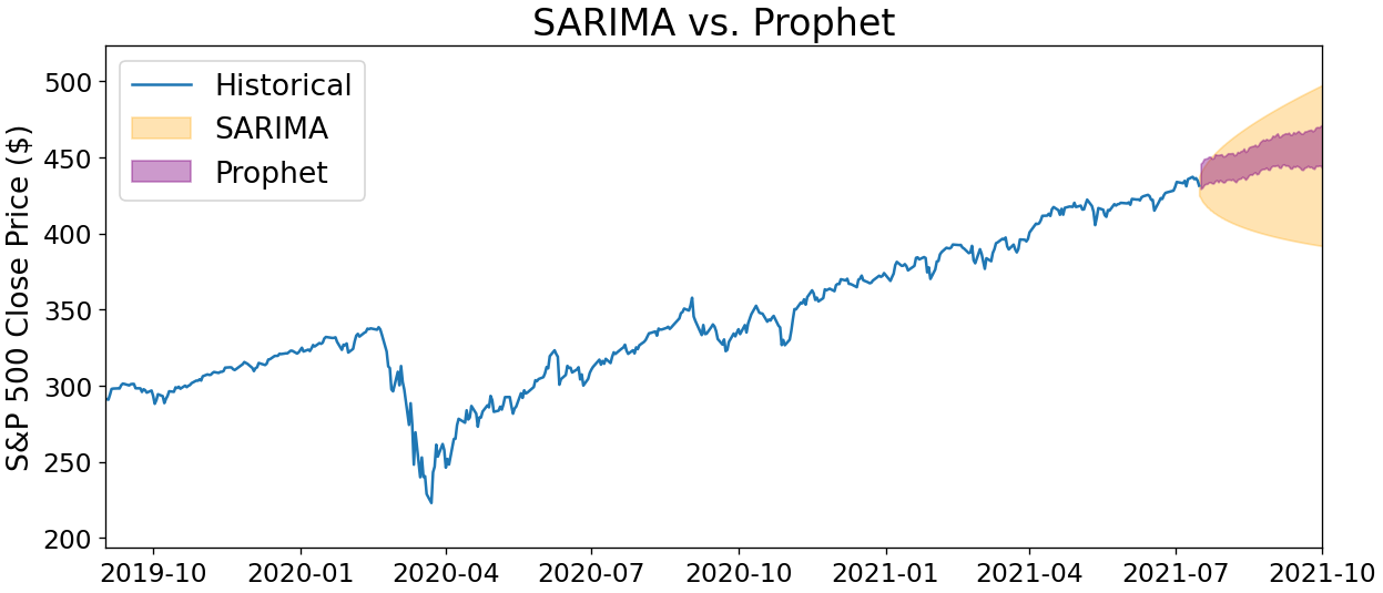
Here’s how we would identify the optimal SARIMA model on our S&P 500 daily closing prices from the start of this post.
| Python |
1
2
3
4
5
6
7
8
9
10
11
12
13
14
15
16
17
18
19
20
21
22
23
24
25
26
27
28
29
30
31
32
33
34
35
36
37
38
39
40
41
42
43
44
45
import pandas as pd
import pmdarima as pmd

df = pd.read_csv("spy.csv")

results = pmd.auto_arima(df['Close'],
                         start_p=0,  # initial guess for AR(p)
                         start_d=0,  # initial guess for I(d)
                         start_q=0,  # initial guess for MA(q)
                         max_p=2,    # max guess for AR(p)
                         max_d=2,    # max guess for I(d)
                         max_q=2,    # max guess for MA(q)
                         m=7,        # seasonal order
                         start_P=0,  # initial guess for seasonal AR(P)
                         start_D=0,  # initial guess for seasonal I(D)
                         start_Q=0,  # initial guess for seasonal MA(Q)
                         trend='c',
                         information_criterion='aic',
                         trace=True,
                         error_action='ignore'
                         )

# Performing stepwise search to minimize aic
# ARIMA(0,1,0)(0,0,0)[7] intercept   : AIC=6671.069, Time=0.03 sec
# ARIMA(1,1,0)(1,0,0)[7] intercept   : AIC=6595.106, Time=0.30 sec
# ARIMA(0,1,1)(0,0,1)[7] intercept   : AIC=6602.479, Time=0.38 sec
# ARIMA(0,1,0)(0,0,0)[7]             : AIC=6671.069, Time=0.03 sec
# ARIMA(1,1,0)(0,0,0)[7] intercept   : AIC=6626.321, Time=0.10 sec
# ARIMA(1,1,0)(2,0,0)[7] intercept   : AIC=6596.194, Time=0.60 sec
# ARIMA(1,1,0)(1,0,1)[7] intercept   : AIC=6595.849, Time=0.53 sec
# ARIMA(1,1,0)(0,0,1)[7] intercept   : AIC=6597.437, Time=0.31 sec
# ARIMA(1,1,0)(2,0,1)[7] intercept   : AIC=inf, Time=2.65 sec
# ARIMA(0,1,0)(1,0,0)[7] intercept   : AIC=6619.748, Time=0.15 sec
# ARIMA(2,1,0)(1,0,0)[7] intercept   : AIC=6588.194, Time=0.39 sec
# ARIMA(2,1,0)(0,0,0)[7] intercept   : AIC=6614.206, Time=0.11 sec
# ARIMA(2,1,0)(2,0,0)[7] intercept   : AIC=6589.336, Time=0.79 sec
# ARIMA(2,1,0)(1,0,1)[7] intercept   : AIC=6588.839, Time=0.68 sec
# ARIMA(2,1,0)(0,0,1)[7] intercept   : AIC=6590.019, Time=0.31 sec
# ARIMA(2,1,0)(2,0,1)[7] intercept   : AIC=inf, Time=3.14 sec
# ARIMA(2,1,1)(1,0,0)[7] intercept   : AIC=6589.040, Time=0.57 sec
# ARIMA(1,1,1)(1,0,0)[7] intercept   : AIC=6592.657, Time=0.47 sec
# ARIMA(2,1,0)(1,0,0)[7]             : AIC=6588.194, Time=0.40 sec
#
# Best model:  ARIMA(2,1,0)(1,0,0)[7] intercept
# Total fit time: 11.975 seconds
The code above says that a SARIMA(2,1,0)(1,0,0)7 model best fits the last five years of S&P 500 data… with some important caveats! Before you gamble your life savings on the forecasts from this model, we should keep in mind that despite a convenient parameter scan, we still have a lot of accuracy we can squeeze out of modeling this data.
For one, we didn’t pre-process the data in any way, such as scanning for outliers or interpolating any gaps. Similarly, we didn’t examine whether any transformations would make the data easier to forecast, such as taking the percent return or square root.
Finally, the frequency of our seasonality, 7, came somewhat out of thin air $-$ there could be a seasonality such as monthly, quarterly, or yearly that significantly improves our model performance. Considerations like these are essential for delivering forecasts that won’t later embarrass you!
(And one more reminder that this post is not investment advice! ;-))
Why not deep learning?
There’s one final concept we haven’t yet covered that provides an important perspective for this post. Classical statistics is great, but in the era of machine learning, is ARIMA a relic from the past? When open-source libraries like Facebook’s Prophet and LinkedIn’s Greykite generate forecasts more accurate than a carefully-polished SARIMAX model, why even bother trying to understand that moving average cupcake example from earlier?
This question touches on an important distinction between machine learning and statistics, and ultimately a tradeoff between accuracy and explainability. To choose which tool to use, you must understand whether your goal is to generate the most accurate prediction possible, or to understand the underlying generative processes in your data.
Machine learning $-$ and deep learning especially $-$ is the tool of choice when you want to maximize accuracy and are willing to sacrifice some explainability. Recurrent neural networks are a powerful forecasting tool, for example, but explaining how the network generated a prediction requires searching through the tangled mess of hidden layers that feed both forward and backward $-$ a daunting task. If senior leadership at your company is weighing a major business decision based on your forecasts, they’re unlikely to accept a model when even you don’t quite understand how it works.
An ARIMA model can therefore be an attractive alternative, even given its lower predictive power. By concretely understanding how values in the time series relate to one another, it’s much easier to build an intuition for the time series itself, such as how much today’s values influence tomorrow, the cycle of seasonality, and more.
The right tool $-$ machine learning or classical statistics $-$ ultimately depends on the broader business context for your analysis. (Prophet actually sits in between these two extremes by using a linear combination of curve-fitting models.)
Conclusions
This post was a deep dive into the ARIMA family of time series forecasting models. We started with some foundational theory of forecasting models, covering autocorrelation and stationarity. We then built simple autoregressive models, where the present value of the time series is the weighted sum of some number of previous values. We then examined moving average processes, a non-intuitive but common phenomenon where the time series remembers historical external noise.
We put these components together to form ARMA models, then showed how an ARIMA model is simply an ARMA model on our differenced data. We then showed how to account for seasonality by adding a set of seasonal autoregressive and moving average components, as well as directly measuring the effects of exogeneous factors on our data.
Finally, we trained a SARIMAX model in Python and performed a parameter scan to identify a potential model order for our S&P 500 closing price dataset. We then discussed why ARIMA may still be a useful option, even when more accurate methods exist.
Time series forecasting is a massive field, and we can fill dozens more blog posts with nuances in model choice and formulation. But regardless of your time series of time series knowledge, I hope it continually trends upward.
Best,
Matt
Footnotes
1. Intro
“We will never be able to perfectly predict the future” sounds obvious, but the reasoning behind it is actually fascinating. In the book Sapiens, Yuval Noah Harari talks about two types of chaotic systems. The first is chaos that doesn’t react to predictions about it, such as the weather. Weather emerges via the nonlinear interactions of countless air molecules $-$ it’s immensely difficult to predict but we can use stronger and stronger computer simulations to gradually improve our accuracy.
The second type of chaotic system, meanwhile, does respond to predictions about it. History, politics, and markets are examples of this type of system. If we perfectly predict that the price of oil will be higher tomorrow than it is today, for example, the rush to buy oil will change its price both today and tomorrow, causing the prediction to become inaccurate.
As data scientists, we’re used to thinking about our analyses as separate from the processes we’re trying to understand. But in cases where our predictions actually influence the outcome, we have little hope to perfectly predict the future… unless perhaps we keep our guesses very quiet.
2. Partial autocorrelation
A sharp drop at lag $n$ in the autocorrelation plot indicates an MA(n) process, while a clear drop in the partial autocorrelation plot indicates an AR(n) process. However, unless your dataset is truly massive, you’ll most likely end up doing a parameter scan to determine the parameters of a model that best describes your data. And if both autocorrelation plots trail off, you’re looking at an ARMA or ARIMA process and will need to do a parameter scan anyway.
3. Stationarity
I went down a long rabbit hole trying to understand what the assumption of stationarity really means. In the graphic of the stationary versus non-stationary processes, I use a noisy sine wave as the example of the stationary process. This dataset does pass the Augmented Dicky-Fuller test, but if you extend the data out to 1000 samples, the ADF test no longer says the time series is stationary.
This is because the ADF in essence measures reversion to the mean $-$ a non-stationary process has no problem drifting away, and previous lags don’t provide relevant information. The lagged values of a stationary process, meanwhile, do provide relevant info in predicting the next values.
4. AR(0): White noise
In our example, the $\epsilon_t$ values are sampled from a normal distribution, so this is Gaussian white noise. We could easily use another distribution to generate our values, though, such as a uniform, binary, or sinusoidal distribution.