
Learning R 2. Random data and plotting
#r
Written by Matt Sosna on December 22, 2015
Learning R series
- Introduction
- Random data and plotting
forloops and random walks- Functions and
ifstatements - The
applyfunctions
For me, coding redefines possibility. With the widespread availability of cheap computational power and online resources for learning how to code, it is easier than ever to pick up a language and start learning from data. A key step early in this journey to unlock insights is data visualization. Producing effective and interesting graphs can not only explain the data better - it can draw viewers in who wouldn’t otherwise be interested.
In this post, we’ll use R’s excellent plotting capabilities to learn about normal distributions, linear regression, and a bit more. With constant feedback from the plots in R, we’ll start learning R syntax along the way.
This is the second post in a series on R. This post covers:
- How do I generate random data?
- How do I plot data?
- How do I run linear regression?
The first post in the series is an introduction to R. It covers importing data, introduction to viewing data, assigning variables, and the help function. The most important code from that post is listed here:
| R |
1
2
3
4
5
6
7
8
# "Concatenate." This is how you create vectors in R
c()

# Assign to x a two-element vector of the numbers 5 and 10
x <- c(5, 10)

# Subset x on only the values greater than 7
x[x > 7]
If you’re determined to start learning at this post instead of the previous one, you can download R here, and you can download RStudio here.
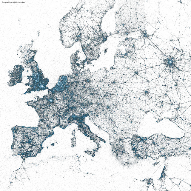
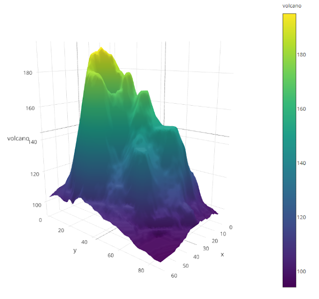
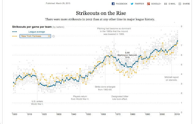
Finally, to give you a sample of the graphical possibilities in R, below are a few beautiful graphs I found online. All were produced in R. For my courteous Facebook friends supporting my blog but not terribly interested in coding: enjoy some pretty pictures!
Miguel Rios: every geotagged tweet 2009-2013
Sample data adopted from plot.ly
Ramnath Vaidyanathan: baseball strikeouts using the R package Shiny
(Also, here’s a great link comparing the raw R exports and then the final publication graphics for the book London: The Information Capital.)
Random data: histograms
Introduction
Randomness might seem like a weird place to start, but it’s actually very useful for learning about distributions and plotting. Let’s start with the normal - also called Gaussian distribution.
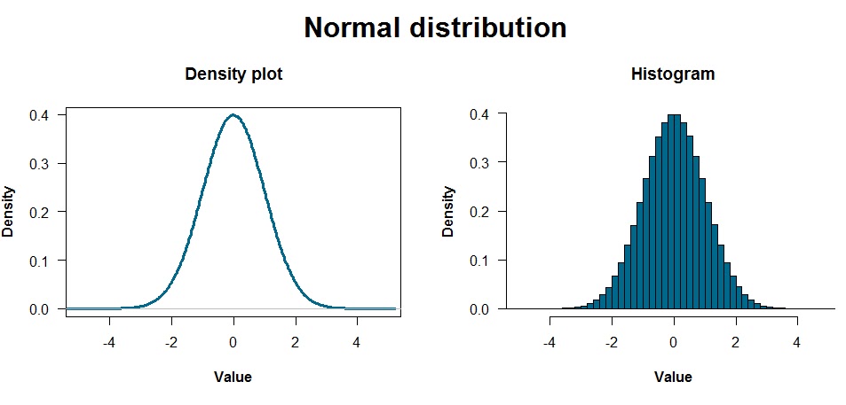
The above plots are a density plot and a histogram, which are pretty similar ways of showing the data. Density plots are particularly useful if you have a lot of data and are estimating the underlying distribution generating that data. Histograms divide the data into bins and show how many points are in each bin.
These distributions reflect data that were generated with one line of code:
| R |
1
data <- rnorm(10000000, 0, 1)
Yup, I generated 10 million random values just like that. I probably could have accomplished the same point with the graphs above by just using 1,000 or 10,000 values… but too late now! You can see these values by typing data and hitting enter, but R will show you all the values… so I wouldn’t do that unless you want to feel like you’re in the Matrix. Use head(data) or summary(data) instead.
The normal distribution
The two most important parameters characterizing a normal distribution are the mean and standard deviation. The mean is the “average” value, which you can see as the peak of the distributions above. The standard deviation is the “spread” of the data. The rnorm command takes three arguments: how many numbers you want, and the mean and standard deviation of the distribution you’re drawing from.
Here’s where R gets fun. Why trust anything I’m telling you about normal distributions? I’m some random person on the internet. You now know enough about R to figure out anything you want about the Gaussian. Instead of puzzling about some abstract definition of standard deviation you read from a textbook, for example, why not generate some distributions and see for yourself?
Standard deviation and the normal distribution
| R |
1
2
3
4
5
6
7
8
9
10
# Tell R to place two plots side by side
par(mfrow = c(1, 2))

# Generate the data
x <- rnorm(1000, 0, 1)  # 1000 values, mean = 0, standard deviation = 1
y <- rnorm(1000, 0, 5)  # 1000 values, mean = 0, standard deviation = 5

# Plot it!
plot(density(x), xlim = c(-20, 20), ylim = c(0, 0.4))
plot(density(y), xlim = c(-20, 20), ylim = c(0, 0.4))
Notes:
- My plots are a bit cleaned up compared to the code above. The code I used for all plots are at the end of this blog post.
- The
xlimandylimarguments above specify the limits on the x- and y-axes, respectively, which is important for showing this comparison. Otherwise, R scales each plot axis to zoom in as much as possible on the data.
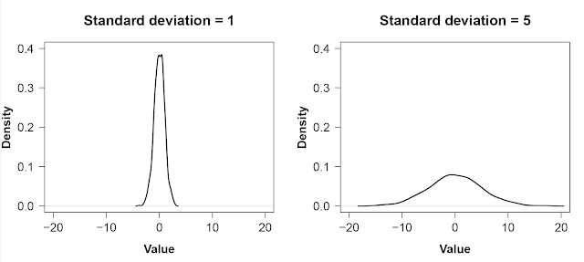
As is strikingly clear, having a small standard deviation concentrates most of the distribution around the mean: most of the values are similar. A large standard deviation, on the other hand, means there is a lot of spread in the data.
Proportion of the normal distribution within a standard deviation
How much of a normal distribution is supposed to be within one standard deviation of the mean? Instead of looking it up on Wikipedia, you can figure it out through R by subsetting and using the length of the data variable:
| R |
1
length(x[(x > mean(x) - sd(x)) & (x < mean(x) + sd(x)])) / length(x)
This code might seem like a lot, but it can be broken into a few simple parts:
| R |
1
2
3
4
5
 length(                # How many values are there?
 x[x > mean(x) - sd(x)  # Subset x to only values > 1 SD below the mean...
 &                      # and...
 x < mean(x) + sd(x)])  # ... less than one SD above the mean.
   / length(x)          # Now, divide all that by the total to get a proportion.
It should be about 68%. Visually, that looks like the plot below. Unsurprisingly, because the standard deviation is 1, the shaded region covers data values from -1 to 1.
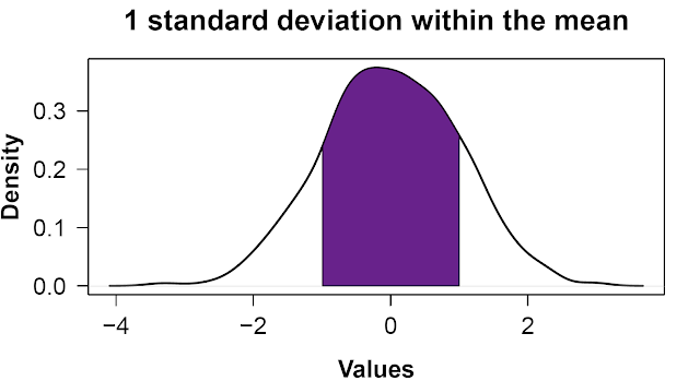
(Another way to write that is mean((x > mean(x) - sd(x)) & (x < mean(x) + sd(x))), which uses a little R trick involving True/False statements[1].
You can modify the code to confirm that ~95% of the distribution lies within 2 standard deviations of the mean, too.
So…
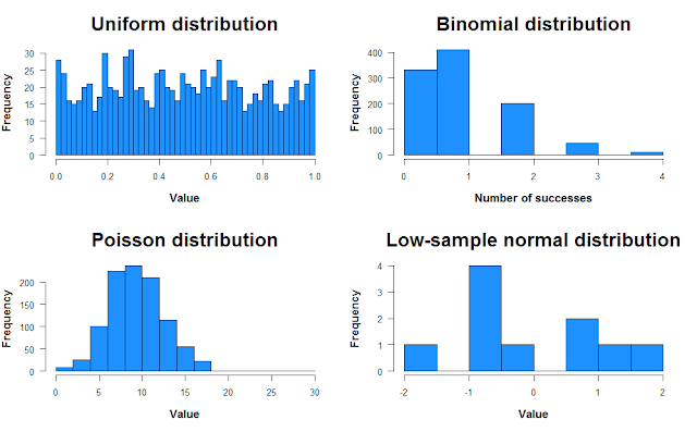
The point of all this is: try things for yourself! Curiosity is excellent fuel for learning R. Think of things, try them in R, learn R as a byproduct. And there’s plenty to learn and play around with! You can create bimodal distributions, trimodal distributions, see how the smoothness of the density plot changes with the number of samples, try uniform and binomial distributions… go for it.
Multimodal distributions:
| R |
1
2
3
4
5
6
7
# Create bimodal and trimodal distributions
bimod <- c(rnorm(1000, -2, 1), rnorm(1000, 2, 1))
trimod <- c(bimod, rnorm(1000, 6, 1))

# Plot them
hist(bimod, breaks = 50)   # Divide the data into 50 bins
hist(trimod, breaks = 75)  # More bins because there are more data
Alternate distributions:
| R |
1
2
3
4
5
6
7
8
9
10
11
12
13
14
15
16
17
18
19
# Uniform distribution
unif <- runif(1000, 0, 1)       # Number of samples, minimum, maximum

# Binomial distribution
binom <- rbinom(1000, 10, 0.1)  # Number of trials, number of attempts,
                                # probability of success
# Poisson distribution
pois <- rpois(1000, 10)

# Low-sample normal distribution
norm <- rnorm(10, 0, 1)

# Plot them
par(mfrow = c(2, 2))

hist(unif, breaks = 50, col = "dodgerblue", main = "Uniform distribution")
hist(binom, col = "dodgerblue", main = "Binomial distribution")
hist(pois, col = "dodgerblue", main = "Poisson distribution")
hist(norm, col = "dodgerblue", main = "Low-sample normal distribution")
Random data: scatterplots
Introduction
There’ve been an awful lot of histograms in this post so far, so let’s end with scatter plots. Let’s first create a data set. We’ll use data we create ourselves so we know precisely what we’re putting into the analysis before we run anything. In other posts, we’ll use data provided by R.
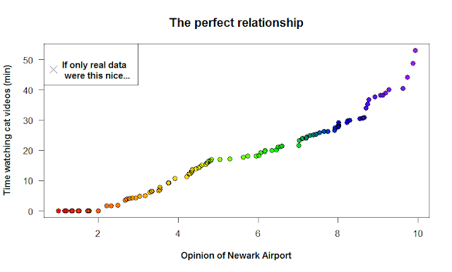
Say you’re an ambitious yet eccentric graduate student interested in the relationship between people’s opinions of Newark Airport, and how much time they spend watching cat videos every day. Let’s also assume there’s an insanely strong correlation between these two variables, so strong that if only Governor Christie knew, he’d focus his attention on finding ways to get more cat lovers flying out of EWR instead of JFK.
We’ll start by creating a perfect relationship between the two, and then adding noise to represent real data. We’ll alter the strength of this noise to better understand statistical significance in regression.
Data generation
We first create the “time spent looking at cats” data. We’ll assume that if we had this data for all 330 million Americans, it’d be a normal distribution with a mean of 15 minutes and a standard deviation of 10. In our experiment, we get a random sample of 100 Americans.
| R |
1
time_cat <- rnorm(100, 15, 10)

time_cat is now a variable that represents the number of minutes 100 people spent watching cat videos. Each element of this vector (i.e. each number) is the amount of time a different person spent in some time period. However, note that you can’t have a negative amount of time spent watching videos. Let’s change those negative values to zero.
| R |
1
2
# Set values lower than zero to zero
time_cat[time_cat < 0] <- 0
Now, let’s generate the data for opinions on Newark airport. Let’s assume it’s a uniform distribution from 1 to 10.
| R |
1
newark_opinion <- runif(100, 1, 10)
To create a strong relationship between the two variables, let’s sort both in ascending order. [Note: never do this with real data! It creates a relationship that doesn’t exist between the variables.]
| R |
1
2
time_cat2 <- sort(time_cat)
new2 <- sort(newark_opinion)
If you plot these data, you get a perfect relationship! Wow! If only real data in ecology was this linear. The command below is saying “plot time spent watching cat videos as a function of your view on Newark Airport.”
| R |
1
plot(time_cat2 ~ new2)
Noise unravels the relationship
Let’s now create three more data sets with varying levels of noise. We generate noise by adding random values to the cat video data to make the relationship between the variables weaker. Note: it’s important we use lots of numbers, as opposed to a constant: adding/subtracting a constant would maintain the relationship but shift it up or down the y-axis. We generate 100 random values with runif below, varying how far from zero the distribution stretches. For the second and third sets, we add noise to the previous set.
| R |
1
2
3
4
5
6
7
8
9
10
11
12
13
14
15
16
noise1 <- time_cat2 + runif(100, -10, 10)
noise1[noise1 < 0] = 0

noise2 <- noise1 + runif(100, -10, 10)
noise2[noise2 < 0] = 0

noise3 <- noise2 + runif(100, -10, 10)
noise3[noise3 < 0] = 0

# Plot it
par(mfrow=c(2,2))

plot(time_cat2 ~ new2)
plot(noise1 ~ new2)
plot(noise2 ~ new2)
plot(noise3 ~ new2)
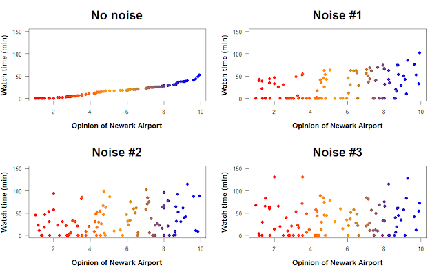
How does the addition of noise change the relationship between opinion of Newark Airport and time spent watching cat videos? We can quantify the strength of the relationship by using linear regression. Linear regression finds a line that goes through the data and minimizes the distance of each point to that line (the residuals). This line represents the relationship between the two variables, and linear regression can tell you if that relationship is positive or negative (and how strongly), as well as whether the relationship is statistically significant.
[Note: there are a few assumptions you have to make when you do linear regression, such as independent samples, homoskedasticity, and that the underlying relationship is actually linear. Definitely check these before you run a linear regression on real data.]
The command in R to build a linear model is lm. We’ll use this and then get our regressions.
| R |
1
2
3
4
reg1 <- lm(time.cat2 ~ new2)
reg2 <- lm(noise1 ~ new2)
reg3 <- lm(noise2 ~ new2)
reg4 <- lm(noise3 ~ new2)
By using the summary command, we can look at the outcome of each test. That’ll give you something like this:
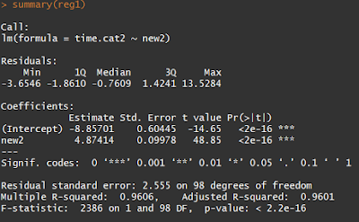
The Pr(>|t|) tells you the p-values for the linear regression slope and intercept, which are unsurprisingly insanely significant for our sorted data. This is saying that if you redid your experiment thousands of times, less than \(2 * 10^{-16}\) proportion of those experiments would have 1) an intercept and 2) a slope as far from zero (or further) as yours. The cutoff for “statistical significance” in p-values is 0.05 (though there is plenty of evidence that the cutoff should be much, much lower).
Meanwhile, the R-squared values at the bottom of the output refer to the direction of the relationship. The minimum possible R-squared value is 0, which would look like a flat line going through data with no relationship between the variables. As you increase or decrease one variable, there’s no effect on the other. The maximum R-squared value is 1, which would be a perfect positive or negative relationship.
Using the summary command on our increasingly noisy data sets shows that, indeed, adding more noise weakens the relationship between the variables. However, it takes three rounds of adding noise before the relationship isn’t statistically significant anymore, probably because the original relationship was unrealistically strong.
For one final figure, let’s look at the “Noise #1” and “Noise #3” data sets. How well does linear regression fit a line through the data?
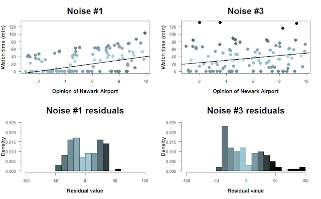
Here, I color-coded the data points based on their residual value, i.e. how far they are from the regression line. The histograms below show the distribution of residuals. Because we can’t have negative time spent watching cat videos, there’s a cutoff on how negative the residuals can be. As the data grow noisier, however, we get larger positive residuals. [Note that the colors don’t correspond perfectly to the scatterplots… I tried!]
Summary
This post covered a lot. We covered generating random data, altering the parameters of the normal distribution, creating a few other types of distributions, scatterplots, noise, and a bit on linear regression.
The main theme of this post, and one that I think is core to coding, is to try things out. Just try things while coding; you almost never get new code right the first try, and that’s fine. Think of coding as a language you can use to answer increasingly sophisticated and interesting questions. If you need to learn how to do a certain analysis in R this week, then go ahead and read up on the specific commands. If you have time, though, let your imagination have a bit of fun. Wander into territory you’ve never tried before and learn whatever R you need to answer that question. That’s a lot more fun, I think, than memorizing commands and saving them for one day you might need them.
- Matt
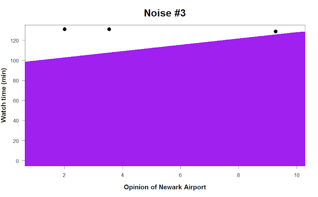
p.s. one final bit of advice. Say you spent hundreds of hours collecting data and it turns out there’s no relationship at all between Americans’ opinion of Newark Airport and how much time they spend watching cat videos every day. Setting the regression line width to 500 in the abline command can completely obscure your data and might make you feel better. :-)
Footnotes
1. Proportion of the normal distribution within a standard deviation
The code in the example was length(x[(x > mean(x) - sd(x)) & (x < mean(x) + sd(x)])) / length(x), which counts the number of occurrences where x > mean(x) - sd(x)) & (x < mean(x) + sd(x) is true, then divides by the entire length of x. While being this verbose is helpful for understanding what exactly we’re doing, it’s often nicer to use a little R trick instead. If we use mean on a truth statement in a vector, R returns the proportion of that vector where the statement evaluated to true. (You can also use sum to just get the count.) The code below illustrates this with a simple example:
| R |
1
2
3
4
x <- c(1, 2, 3, 4, 5)
x > 2        # FALSE FALSE TRUE TRUE TRUE
sum(x > 2)   # 3      <- counts the number of True elements
mean(x > 2)  # 0.6    <- proportion of elements that are True
Code for generating the plots in this post
Normal distribution: density plot and histogram
| R |
1
2
3
4
5
6
7
8
9
10
11
12
13
14
15
16
# Generate the data
data <- rnorm(1e7)

# Set two plots side by side, and allow space for an overall header
par(mfrow = c(1, 2), oma = c(0, 0, 2, 0))

# Density plot
plot(density(data), las = 1, main = "Density plot", lwd = 3,
     xlab = "Value", col = "deepskyblue4", font.lab = 2, xlim = c(-5, 5))

# Histogram
hist(data, breaks = 50, las = 1, xlab = "Value", main = "Histogram",
     freq = F, col = "deepskyblue4", font.lab = 2, xlim = c(-5, 5))

# Title
mtext("Normal distribution", outer = T, cex = 2, font = 2)
Normal distribution: sd = 1, sd = 5
| R |
1
2
3
4
5
6
7
8
9
10
11
12
# Generate the data
x <- rnorm(1000, 0, 1)
y <- rnorm(1000, 0, 5)

# Plot it
plot(density(x), xlim = c(-20, 20), ylim = c(0, 0.4),
     lwd = 2, font.lab = 2, las = 1,
     main = "Standard deviation = 1", xlab = "Value")

plot(density(y), xlim = c(-20, 20), ylim = c(0, 0.4),
     lwd = 2, font.lab = 2, las = 1, main = "Standard deviation = 5",
     xlab = "Value")
Shaded-in normal distribution
| R |
1
2
3
4
5
6
7
8
9
10
11
12
13
14
15
16
17
# Generate the data and save a variable of the density plot
x <- rnorm(1000)
d <- density(x)

# Find the x-values within the density plot that are at the -1 SD and +1 SD mark
m <- max(which(d$x <= mean(x) - sd(x)))
m2 <- min(which(d$x >= mean(x) + sd(x)))

# Create the coordinates for the shaded region
coord.x <- c(d$x[m], d$x[m:m2], d$x[m2])
coord.y <- c(0, d$y[m:m2], 0)

# Plot it
par(mfrow = c(1, 1))
plot(d, lwd = 2, main = "1 standard deviation within the mean",
     xlab = "Values", las = 1, font.lab = 2)
polygon(coord.x, coord.y, col = "darkorchid4")
Alternate distributions
| R |
1
2
3
4
5
6
7
8
9
10
11
12
13
14
15
16
17
18
19
20
21
22
23
24
25
26
27
28
29
30
# Uniform distribution
unif <- runif(1000, 0, 1)       # Number of samples, minimum, maximum

# Binomial distribution
binom <- rbinom(1000, 10, 0.1)  # Number of trials, number of attempts, probability of success

# Poisson distribution
pois <- rpois(1000, 10)         # Number of trials, expected value

# Low-sample normal distribution
norm <- rnorm(10, 0, 1)

# Plot them
par(mfrow = c(2, 2))

hist(unif, breaks = 50, col = "dodgerblue",
     main = "Uniform distribution", xlab = "Value",
     las = 1, font.lab = 2, cex.main = 2, cex.lab = 1.3)

hist(binom, col = "dodgerblue", main = "Binomial distribution",
     xlab = "Number of successes", las = 1, font.lab = 2,
     cex.main = 2, cex.lab = 1.3)

hist(pois, col = "dodgerblue", main = "Poisson distribution",
     xlab = "Value", las = 1, font.lab = 2, cex.main = 2,
     cex.lab = 1.3)

hist(norm, col = "dodgerblue", main = "Low-sample normal distribution",
     xlab = "Value", las = 1, font.lab = 2, cex.main = 2,
     cex.lab = 1.3)
The perfect relationship
| R |
1
2
3
4
5
6
7
8
9
10
11
12
13
14
15
16
17
# Load library. If you don't have this package: install.packages('RColorBrewer')
library(RColorBrewer)

# Create the color palette
colors <- colorRampPalette(c("red", "orange", "yellow", "green", "blue", "purple"))(n = 100)

# Plot it
plot(time2 ~ new2, main = "The perfect relationship",
     xlab = "Opinion of Newark Airport", col = colors, pch = 19,
     ylab = "Time watching cat videos (min)", las = 1, font.lab = 2,
     cex.main = 1.4, cex = 1.2)
points(time2 ~ new2, cex = 1.2)     # Add a margin around the points

# Add a legend
par(font = 2)                # Bold the text inside the legend
legend("topleft", pch = 4, pt.cex = 1.7,
       legend = "If only real data\n were this nice...") # Break text into 2 lines
Noisy scatter plots
| R |
1
2
3
4
5
6
7
8
9
10
11
12
13
14
15
16
17
# Load library
library(RColorBrewer)

# Create the color palette
colors <- colorRampPalette(c("red","orange","blue"))(n = 100)

# Combine the data into a matrix for ease in plotting
plots <- cbind(time2, noise1, noise2, noise3)
titles <- c("No noise", "Noise #1", "Noise #2", "Noise #3")

# Use a for loop to avoid writing all the figure specifications 4 times
for(i in 1:ncol(plots)){
   plot(plots[, i] ~ new2, main = titles[i], pch = 19,
        ylim = c(0,150), las = 1, col = colors, cex = 1.2,
        xlab = "Opinion of Newark Airport", ylab = "Watch time (min)",
        font.lab = 2, cex.main = 2, cex.lab = 1.3)
}
Residuals
| R |
1
2
3
4
5
6
7
8
9
10
11
12
13
14
15
16
17
18
19
20
21
22
23
24
25
26
27
28
29
30
31
32
33
34
35
36
37

 # Load library (unnecessary if you already did in this R session)
 library(RColorBrewer)

# Run the linear regressions for Noise #1 and Noise #3 data
 reg2 <- lm(noise1 ~ new2)
 reg4 <- lm(noise3 ~ new2)

 par(mfrow = c(2,2))

# Create a vector of color values from light blue to black
cols <- colorRampPalette(c("lightblue","black"))(n = 101)

# Scatter plot #1
plot(noise1 ~ new2, pch = 19, col = cols[round(abs(reg2$resid))], cex = 1.6, font.lab = 2,
     las = 1, ylim = c(0, 130), main = "Noise #1", xlab = "Opinion of Newark Airport",
     ylab = "Watch time (min)", cex.main = 2, cex.lab = 1.3)

# Add the linear regression line
abline(reg2, lwd = 2)

# Scatter plot #2. Colors didn't work unless I added 1... don't know why
 plot(noise3 ~ new2, pch = 19, col = cols[round(abs(reg4$resid + 1))], cex = 1.6, font.lab = 2,
     las = 1, ylim = c(0, 130), main = "Noise #3", xlab = "Opinion of Newark Airport",
     ylab = "Watch time (min)", cex.main = 2, cex.lab = 1.3)
abline(reg4, lwd = 2)

# Second color vector. I cheated a bit to make the histograms look closer to scatter plots
cols2 <- colorRampPalette(c("#4A5C62", "lightblue", "black", "black"))(n = 20)

# Histograms
hist(reg2$resid, breaks = 10, col = cols2, xlim = c(-100, 100), freq = F, ylim = c(0, 0.025),
     las = 1, main = "Noise #1 residuals", xlab = "Residual value", cex.main = 2, cex.lab = 1.3,
     font.lab = 2)
hist(reg4$resid, breaks = 20, col = cols2, xlim = c(-100, 100), freq = F, ylim = c(0, 0.025),
     las = 1, main = "Noise #3 residuals", xlab = "Residual value", cex.main = 2, cex.lab = 1.3,
     font.lab = 2)
Shameful abline
| R |
1
2
3
4
5
par(mfrow = c(1,1))
plot(noise3 ~ new2, pch = 19,  cex = 1.6, font.lab = 2,
     las = 1, ylim = c(0, 130), main = "Noise #3", xlab = "Opinion of Newark Airport",
     ylab = "Watch time (min)", cex.main = 2, cex.lab = 1.3)
abline(reg4, lwd = 500, col = "purple")
Image credits:
- Twitter map: Miguel Rios
- 3D surface plot: plot.ly
- Baseball time series: Ramnath Vaidyanathan
- Kitten: theheightsanimalhospital.com