
How to enter data science 2. The statistics
#careers
#data-science
#statistics
Written by Matt Sosna on December 5, 2020
In the last post, we defined the key elements of data science as 1) deriving insights from data and 2) communicating those insights to others. Despite the huge diversity in how these elements are expressed in actual data scientist roles, there is a core skill set that will serve you well no matter where you go. The remaining posts in this series will define and explore these skills in detail.
The next three posts will cover the technical skills needed to be successful as a data scientist: the statistics (this post), the analytics, and the engineering. The final post will cover the business, personal, and interpersonal skills needed to succeed. Consider the distinction here as knowing how to do it (technical) versus knowing what to do and why (business, personal, and interpersonal). Let’s get started!
How to enter data science:
- The target
- The statistics
- The analytics
- The engineering
- The people
Becoming one with the machine
Data science is a broad field that is still iterating towards a solid distinction from data analytics, data engineering, and software engineering, so it’s hard to create a definitive skill set that’s applicable for all data scientist roles. Someone working all day with building statistical models out of spreadsheets, for example, is going to need a different set of skills than someone improving autonomous vehicles!
But consider this learning checklist as a set of fundamental skills that will get you started for your role, no matter where you go. We’ll cover the Inferential Statistics section in this post, Analytics in the next, and Software Engineering in the fourth.
- Inferential Statistics
- Experimental design
- Comparisons between groups
- Predictive modeling
- Model internals
- Analytics
- Dataframes
- Arrays
- Visualizations
- Descriptive statistics
- Working with dates and time
- Machine learning
- Software engineering
- Accessing data
- Version control
- Object-oriented programming
- Virtual environments
- Writing tests
Intro to Stats
Inferential statistics is the discipline of drawing inferences about a population from a sample. We rarely have data on every single individual, decision, or atom in whatever process we’re examining. Rather than throw in the towel on understanding anything around us, we can turn to statistics for tools that translate data on our sample into inferences on the entire population. Inferential statistics is used all the time to make sense of the world, from weather forecasts to opinion polls and medical research. Thinking carefully about how to generalize from our data to the broader world is a critical skill for data science, so we’ll want to make sure we have a solid grasp of stats.
Wait, do I actually need to learn stats?
In the era of big data and machine learning, it’s tempting to shrug off learning any stats. When the average laptop is 2 million times more powerful than the computer that got us to the moon[1], it’s easier than ever to throw a dataset into a deep learning algorithm, get a coffee while it crunches the numbers, and then come back to some model that always delivers world-shattering insights. Right? Well… not quite.[2]
As data scientists, a core part of our job is to generate models that help us understand the past and predict the future. Despite the importance of getting models right, it’s easy to create models with serious flaws. It’s then uncomfortably easy to make confident recommendations to stakeholders based on these flawed models. The following quote usually refers to the quality of data going into an analysis or prediction, but I think it’s an apt summary for why we need to care about stats as well.
“Garbage in, garbage out.”
A model is a simplified representation of reality. If that representation is flawed, the picture it paints can very easily be nonsensical or misleading. The reason people dedicate their lives to researching statistics is that condensing reality down to models is incredibly challenging, yet necessary.
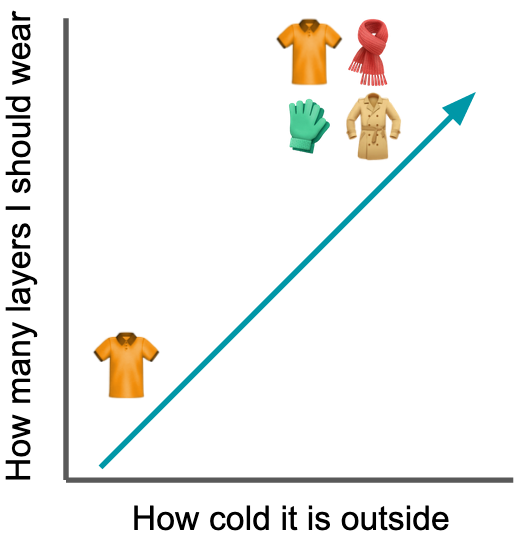 It’s usually impossible or impractical to process every detail before making a decision; our brains, for example, constantly use processing short-cuts to interpret the world faster. You don’t need to memorize what clothes to wear for every possible temperature outside; you know that, in general, as the temperature goes down, you put on more layers. This mental model isn’t perfect $-$ sometimes it’s windy or humid, and a different number of layers feels more comfortable $-$ but it’s a great rule of thumb.
When we build a model, the question isn’t how to make a model that isn’t flawed; it’s how to ensure the flaws don’t affect the conclusions. The fact that wind or humidity sometimes alters the best number of layers doesn’t change the fact that “the colder it is, the more clothes I should put on” is a good model. As statistician George Box (allegedly) said:
“All models are wrong, but some are useful.”
The difference between a model that’s wrong but useful versus one that’s just wrong is often hidden in the details. Unlike in programming, hitting “run” on a half-baked model will output a result that qualitatively looks identical to a highly-polished, accurate model. But whether the model represents the reality we actually live in requires a trained eye.
Ok, so how much stats do I actually need?
It’s hard not to write an entire textbook when it comes to important stats concepts for data science. It’s also hard to identify which concepts are most relevant for data scientists, given the tremendous variation in depth of statistical knowledge expected.
You’ll need far more than intro stats if you’re expected to inform major decisions like public policy or the direction your company takes[3], but basic stats may be more than enough if your role is deep in the engineering side of data science. Similarly, if you’re in a field where you actually do have access to all the data in a process, such as analyzing Internet of Things (IoT) sensor data or applying natural language processing to legal documents, then you’ll want a deep dive on additional stats skills, like time series analysis, clustering, and anomaly detection.
Consider the following concepts, then, as a starting point that you can then build off and tailor to your specific role. I’m assuming you have some basic familiarity with stats but maybe haven’t done a deep dive into the nuances of assumptions, coefficients, residuals, etc.
Here are (some![4]) stats essentials I think any data scientist should feel comfortable explaining to both technical and non-technical audiences:
- Experimental design: sampling and bias, control groups, correlation vs. causation
- Comparisons between groups: t-tests, ANOVA
- Predictive modeling: regression, classification
- Model internals: coefficients, residuals, p-values, $R^2$
We’ll go through each of these in the rest of the post. Note that machine learning will be covered in the next post. Let’s get started!
Experimental design
Broadly, experimental design refers to how we structure our data collection process. Do we poll our friends on Facebook, passersby at the mall, or random phone numbers? Does every patient get the drug, or do we give some a placebo? Think of the quality of any analysis we run as a funnel starting from the quality of the data we collect. If we have solid data, we can ask more interesting questions and discover more meaningful insights. If we have shoddy data, there’ll always be that shadow of doubt for whether the results can truly be trusted. So, let’s make sure we can identify how to get good data.
Sampling and bias
 One of the key concepts to understand is that when you collect data, you are sampling from a population. (Except in newer fields like IoT.) Because we’re condensing a large, diverse body down into a relatively small sample, we need to make sure the sample actually looks like a microcosm of the broader population.
In the graphic on the right, for example, our sample isn’t really representative of the population $-$ several colors aren’t present at all! We can’t run an analysis on this sample and then generalize to the population; we can only generalize to red, orange, yellow, and green. No matter how perfectly we model our sample data, our model’s scope is trapped. If we try to comment on the broader population, we’ll find that our seemingly accurate model suddenly makes embarrassingly inaccurate predictions.
A recent example of this sample-population discrepancy is the 2020 U.S. election forecasts. After President Trump’s surprise 2016 victory that defied the vast majority of public opinion polls, pollsters spent years tweaking their models, fixing blindspots in preparation for a 2020 redemption. Yet, as states started releasing results on November 3, we found ourselves yet again watching polls underestimate the number of Trump voters.
David Shor, the former head of political data science at Civis Analytics, believes the predictions were so off because their underlying samples are not representative of American voters. In short, the people who respond to polls tend to score high on social trust, which the General Social Survey indicates represents only 30% of Americans. Until 2016, this group used to vote comparably to low-trust voters who didn’t pick up the phone for pollsters $-$ now, low-trust voters tend to vote more conservatively and are hence underrepresented in the sample.
If we’re aware of these discrepancies, we can try to implement fixes such as differentially weighting classes in the sample. But the best remedy is to make sure the sample is truly representative of the broader population. Note: this is often easier said than done!
Control groups
Another key concept to know for experimental design is control groups. Typically when we run an experiment, we’re looking to quantify the effect of some treatment. Does the antidepressant reduce depression? Did the new website layout increase sales? To understand whatever number we get for our effect size, we need a baseline to compare it to. This is where control groups come in.
 Images adapted from Kumar et al. 2013
In the real world, innumerable factors affect every process we observe. We need a way to control as many of those factors as possible so we can zone in on the one factor $-$ our treatment $-$ that we’re interested in. Think of a good control group as a (nearly) identical twin of our treatment group, differing only in our treatment. “Subtracting out” the control, like in the background subtraction above, lets the effect of our treatment pop out. (Or not, if our treatment actually doesn’t have an effect.)
Placebos are a classic example of controls. Medical studies examining the effectiveness of new drugs always contain a control group that gets a placebo rather than the real drug, as people often feel better just knowing they got a drug, even if the “drug” is just a sugar pill. Without the placebo group, our false positive rate would be off the charts.
Another classic control group is the treatment group itself, before receiving the treatment. Within-subject designs are incredibly powerful, as we have much finer control over all the external factors that could affect our experiment: they’re literally the same participants! You can see this added power in the equations for a two-sample t-test versus a paired t-test: the $t$ value will be larger for the paired test because the denominator is smaller, since you’re only counting the $n$ of one (paired) sample.[5]
\[t_{two-sample} = \frac{\bar{x_1} - \bar{x_2}}{\sqrt{\frac{(s_1)^2}{\color{orange}{\boldsymbol{n_1}}}+\frac{(s_2)^2}{\color{orange}{\boldsymbol{n_2}}}}}\] \[t_{paired} = \frac{\bar{d}}{\frac{s_d}{\sqrt{\color{violet}{\boldsymbol{n}}}}}\]One final example particularly relevant for web development is A/B testing. To experimentally determine ways to drive higher user engagement or conversions, a company may present users with nearly identical versions of a webpage differing in only one aspect, like the color of a button. The company can then compare these webpage variants to one another, as well as the original webpage (the control group), to choose the most effective option.
Correlation vs. causation
When analyzing data, it’s common to see that two variables are correlated: when A changes, B changes too. We might notice that sales of ice cream and sunscreen neatly follow one another, for example, but does this mean that ice cream sales cause sunscreen sales? (“I’d like a scoop of chocolate chip, and hm… let’s get some sunscreen too.”)
Disentangling whether changes in ice cream sales are causing changes in sunscreen sales (or vice versa), there’s some hidden factor affecting both, or it’s just a random coincidence is a job for experimental design. To truly say that A causes B, we need to control for variation external to A and B, then carefully manipulate A and observe B. For example, we could have ice cream marketing blitzes throughout the year, driving up sales regardless of the weather, and see whether sunscreen sales then follow.
Note that there’s nothing wrong with saying that A and B are related. If there’s a correlation, it still tells us something about A and B. But the bar is much higher if you want to say one causes the other.
Comparisons between groups
A central question in statistics $-$ and life, really $-$ is whether things are the same or different. Do smokers tend to have higher rates of lung cancer than non-smokers? Does eating an apple in the morning make you more productive than eating an orange? When we collect data on our groups of apple-eaters versus orange-eaters, the means of our samples will inevitably be different. But do the populations of apple-eaters and orange-eaters differ in the productivity?
We need to use statistics to draw inferences about the populations from our samples. I’ll briefly cover t-tests and Analyses of Variance below.
T-tests
The main idea behind a two-sample t-test is to determine whether the samples are drawn from the same population. I’m going to assume this isn’t the first time you’re reading about t-tests (if it is, there are lots of great resources like this post), so I’ll instead focus on how to avoid misusing a t-test.
When you conduct a t-test, you’re assuming the following about your data:
- The data in your sample are continuous, not discrete
- The data in your sample are independent from one another and were all equally likely to be selected from their population
- Your sample is not skewed and doesn’t have outliers (less important as sample size increases)
- For a two-sample test, the variances of the population distributions are equal
If these conditions aren’t met, don't run a t-test! R, Python, and the t-test equation itself won’t stop you from generating a meaningless result $-$ it’s on you to realize whether you should run the test. #2 in particular can be devastating for unwary researchers; violating this assumption means you have to dip into some gnarly advanced methods or throw out the data and try again. #3 is more generous: it’s possible to use nonparametric alternatives like the Wilcoxon test or to transform your data to make it normally distributed.
ANOVA
If you have more than two samples you’re comparing at once, you’ll need to run an Analysis of Variance. Don’t run multiple consecutive t-tests! I did a deep dive here on how the false positive rate skyrockets when you run consecutive pairwise t-tests on multiple groups. I think the heatmaps below summarize the main message well.
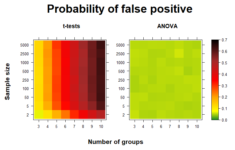
In short: if you’re trying to determine whether the means of the populations of multiple samples differ, first run an ANOVA, followed by Tukey’s method or Bonferroni’s correction if you find significant differences.
Predictive modeling
Predictive modeling is about taking in data and trying to model the underlying process that generated that data. Once we understand the underlying rules, we can then generate predictions for new data. Thinking back to our weather outside vs. clothing model, we don’t need to memorize what clothes to wear for every possible temperature; we just need to use our mental model.
This section will cover regression and classification. But before we get started, a quick pro tip: always plot your data before you start building any models! This step can help you catch outliers, determine whether feature engineering steps like log transformations are required, and ensure your model is actually describing your data.
Regression
When we want to predict a continuous value, we use regression. Here’s the equation for linear regression. Learn it well!
\[h(x) = \sum_{j=0}^{n}\beta_jx_j\]Here $h(x)$ is our predicted value and $n$ is the number of features in our data. The equation for a model where we predict a student’s exam score ($h(x)$) based off their hours studied ($x_1$) and hours slept the previous night ($x_2$) would look like this[6]:
\[h(x) = \beta_0 + \beta_1x_1 + \beta_2x_2\]No matter where you work, it’s hard to escape the simplicity and convenience of a good linear regression model. Linear regressions are extremely fast to compute and they’re easy to explain: the coefficients give a clear explanation of how each variable affects the output[7], and you just add all the $\beta_jx_j$ together to get your output. Make sure you have your “30-second spiel” ready for regression, since you’ll likely be explaining these models repeatedly to various stakeholders.
Once you’re comfortable, make sure to brush up on more advanced topics, like feature scaling, interactions, and collinearity, as well as model regularization and how coefficients are calculated. This might sound like a lot, but given how frequently you’re likely going to run and explain regressions in your work, it’s good to really understand what they’re about.
Classification
Classification models predict distinct output categories. A logistic regression version of the above model, where we’re now predicting whether a student passed or failed the exam based on the number of hours they studied and slept, would look like this:
\[P(y) = \frac{1}{1+e^{-h(x)}}\]Here \(h(x) = \beta_0 + \beta_1x_1 + \beta_2x_2\) and $y$ is the event of passing the exam.[8]
Our model will output a probability of $y$ occurring, given our predictors. We can work with these outputted probabilities directly (as in credit default risk models), or we can binarize them into 0’s and 1’s. In our student model, this would mean predicting whether the student passed (1) or failed (0) the exam. We typically use $P(y)$ = 0.5 as the probability cutoff.
Let’s quickly go through two important concepts for logistic regression: 1) understanding how values of $h(x)$ translate into probabilities $P(y)$, and 2) understanding the decision boundary.
Translating $h(x)$ to $P(y)$
Setting $h(x)$ to the extremes helps clarify its role in the equation. Let’s say $h(x)$ is extremely negative. That would mean $-h(x)$ would be positive, which would make $1 + e^{-h(x)}$ huge. For example, if $e^{-h(x)}$ is 10000000, we see $P(y)$ is nearly zero.
\[P(y) = \frac{1}{1+10000000} = 0.0000001\]On the other extreme, if $h(x)$ is extremely positive, then $-h(x)$ becomes tiny, meaning we’re essentially dividing 1 by 1. When $e^{-h(x)}$ is 0.0000001, we see $P(y)$ is pretty much 1.
\[P(y) = \frac{1}{1+0.0000001} = 0.9999999\]Finally, what happens when $h(x)$ equals zero? Any real number raised to the zeroth power equals 1, so $e^{-h(x)}$ becomes 1.
\[P(y) = \frac{1}{1+1} = 0.5\]When $h(x)$ equals zero, $P(y)$ equals 0.5. If we’re using 0.5 as the probability cutoff, that means we’ll predict the student passed if $h(x)$ is positive. If $h(x)$ is negative, we’ll predict the student failed. This leads us nicely into the next section…
Making sense of $h(x)$
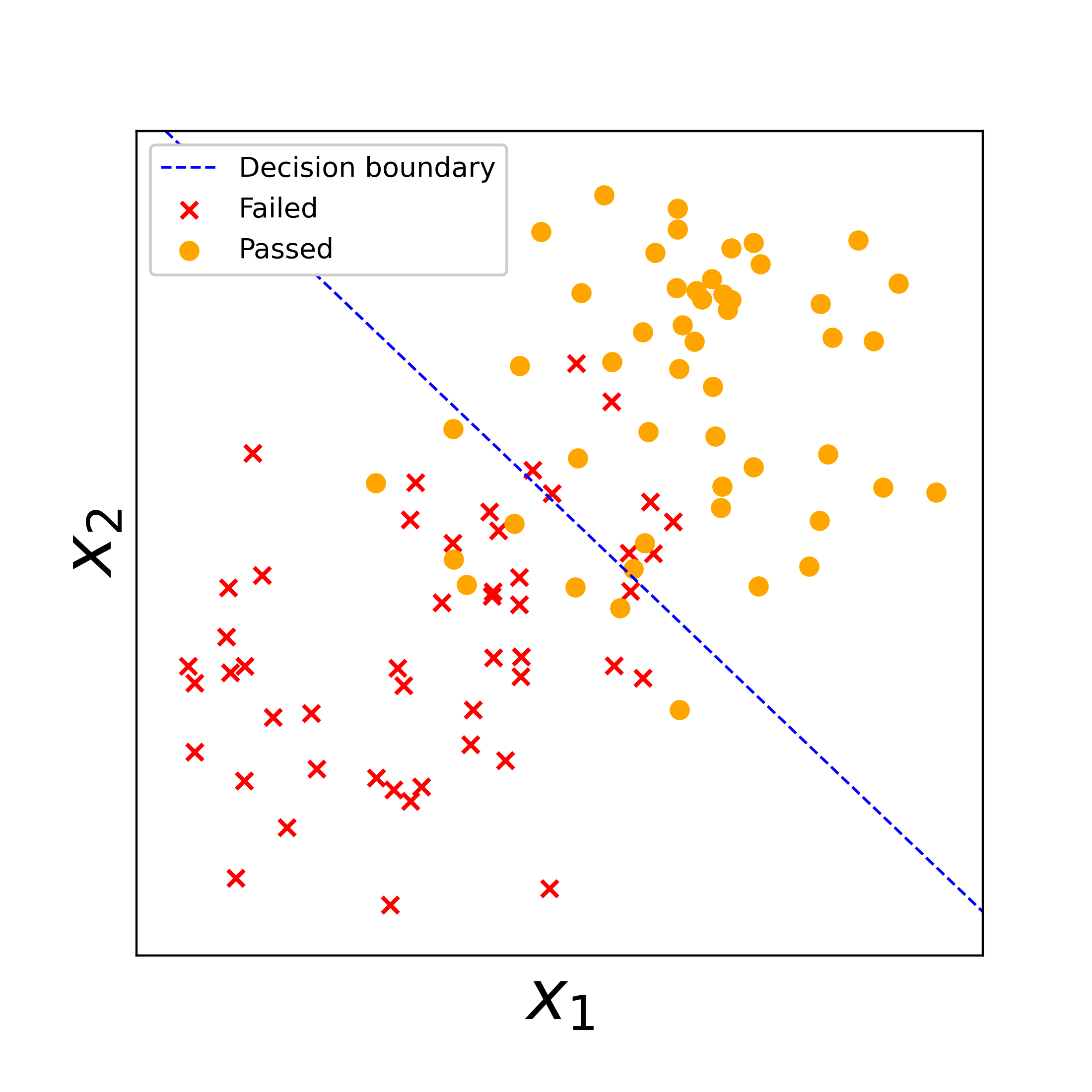 So what’s up with $h(x)$? In short, when $h(x)$ = 0, we get a line that best separates our data into classes. Training a logistic regression model is all about identifying where to put this line to best separate the classes in the data.
In the figure on the right, we’ve plotted some fake training data of students who passed vs. failed the exam. The blue line is the model’s decision boundary, where it determined the best separation of the “passed” vs. “failed” classes falls, based on $x_1$ and $x_2$. For any new data falling to the left of the decision boundary, our model will predict the student failed. For any new data falling on the right, our model will predict the student passed. It’s not perfect $-$ there are some “passed” students on the left and “failed” students on the right $-$ but this is the best separation the model could come up with.
Once you’re comfortable with these topics, it’s a small step to move onto logistic regression models for more than two classes, such as multinomial and one-vs-rest classification.
Model internals
Once we’ve actually fit a model and it’s sitting there in R or Python, what do we actually have? How can we tell which features are significant, and if the model is actually explaining variation in our target variable? This section will examine coefficients and residuals, as well as the meaning behind p-values and $R^2$.
Coefficients
Let’s take another look at the linear regression model that predicts student exam scores.
\[h(x) = \beta_0 + \beta_1x_1 + \beta_2x_2\]The intercept ($\beta_0$), study multiplier ($\beta_1$), and sleep multiplier ($\beta_2$) are the coefficients of our model. These parameters convert our inputs (hours studied and hours slept) to the output (exam score). A coefficient of 10 for $\beta_1$, for example, means that a student’s score is expected to increase by 10 for each additional hour they study. An intercept of 30 would mean the student is expected to get a 30 if they don’t study or sleep at all.
Model coefficients help us understand the trends in our data, such as whether studying an extra hour versus going to bed would lead to a higher exam score. But we should always take a careful look at the coefficients before accepting our model. I always try to mentally validate the strength and direction of each coefficient when I examine a model, making sure it’s about what I’d expect, and taking a closer look if it isn’t. A negative sleep coefficient $\beta_2$, for example, would indicate something wrong with our data, since sleep should improve exam scores! (If not, maybe our students or the exam they took are very strange…) Similarly, if our intercept is above 100 and the study and sleep coefficients are negative, we likely have too little data or there are outliers hijacking our model. Make sure to plot your data to confirm the trends are actually what you think they should be.
Finally, we should always look at the confidence interval for our coefficient before accepting it. If the interval crosses zero, for example, our model is saying it can’t determine the direction our feature affects the target variable. Unless you have good reason to keep that feature (e.g. to specifically show its lack of impact), you should drop it from the model. Similarly, if the interval doesn’t cross zero but is still large relative to the size of the coefficient, our model is indicating it can’t pinpoint the specific effect our feature has on the target variable, so we perhaps need more data or a different model formulation to understand the relationship.
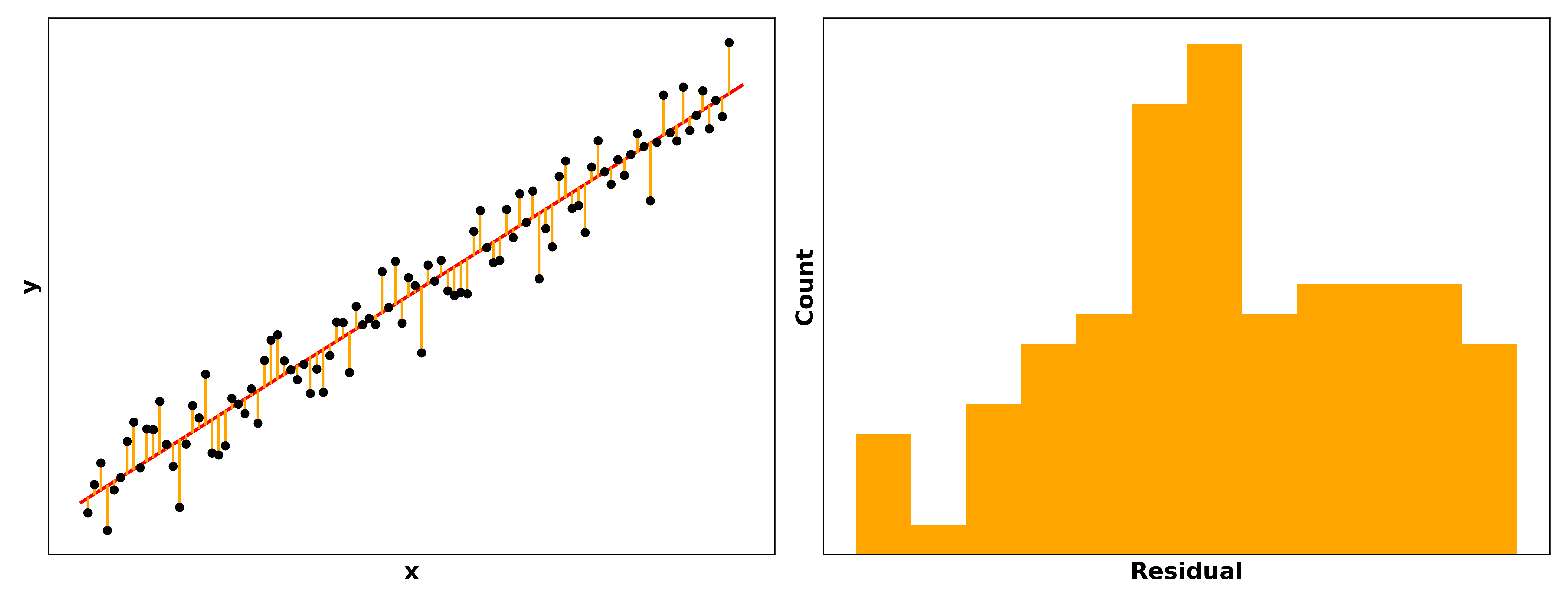
Residuals
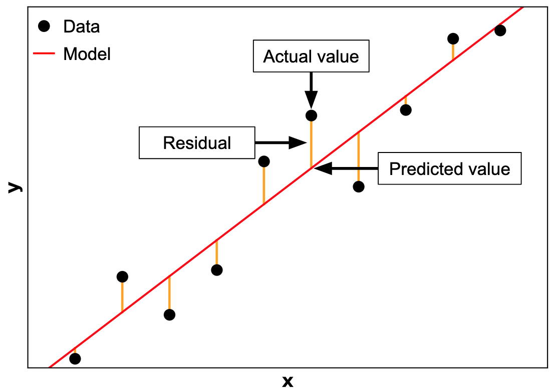 Once we’ve built a model, how do we tell if it’s any good? One way is to compare the model's predictions to the actual values in our data. In other words, given some sample inputs, what does the model think the output is, versus what the output actually is? For regression models, the residual is the distance between the predicted versus actual values.[9]
You can see this illustrated in the graphic on the right. The distance between the predictions (red line) and the actual values (black points) are the residuals. The goal with building a model is to get the predicted and actual values as similar as possible $-$ to minimize the residuals, in other words.[10] A more accurate model will tend to generate predictions closer to the actual values than an inaccurate one.
Especially for linear models, the residuals should be normally distributed around zero, meaning our predictions are usually pretty good but sometimes a little too high or too low, and rarely way too high or way too low.
As a third reminder in this section alone, it’s important to plot your data! R and Python won’t stop you from fitting a model that doesn’t make sense, and stakeholders will quickly lose faith in your recommendations if they find logical holes in your models that you didn’t catch. (It’s often already hard enough to convince stakeholders to trust a model with airtight logic… don’t make it harder!)
For example, let’s say you build a model predicting how happy a person is as a function of the size of their Pokémon card collection. You plot the data on top of the model’s predictions, plot the residuals, and see something like this:
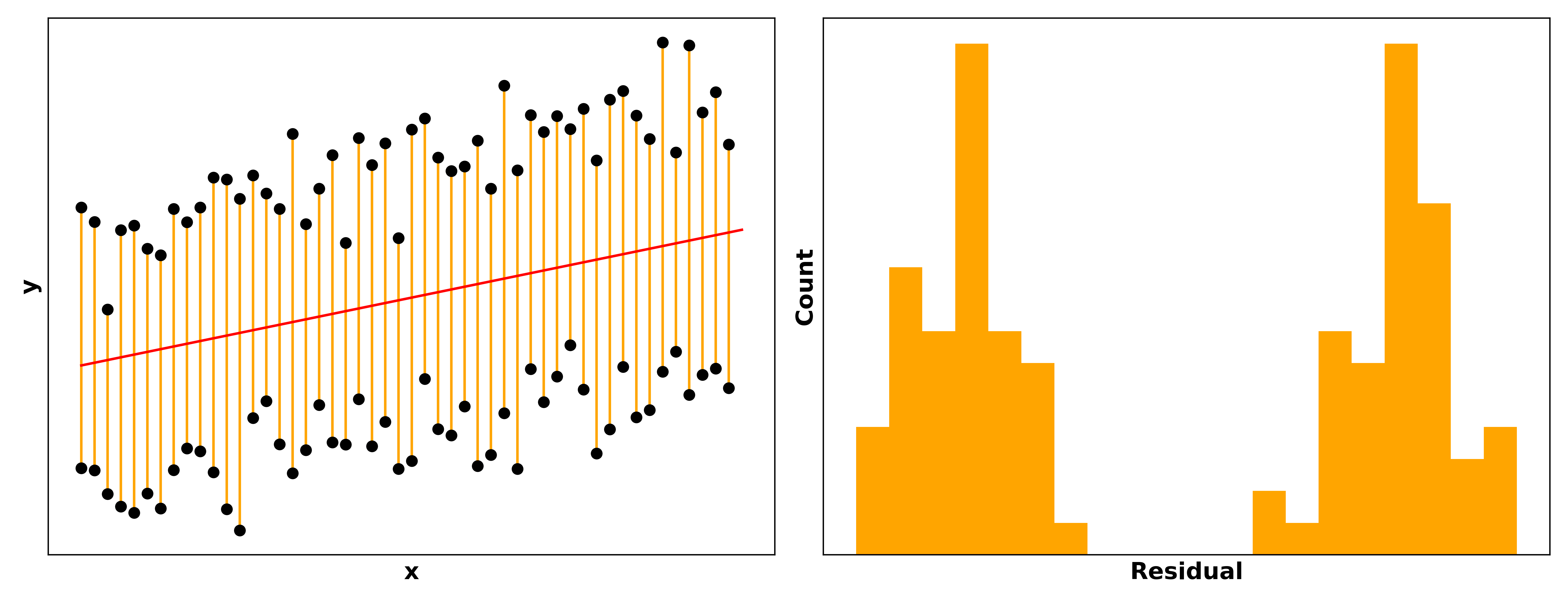
The double sets of points and the bimodal residuals clearly indicate there’s some unaccounted factor affecting our data… maybe whether the person is a child or an adult! A simple fix for this would be to add a “child vs. adult” feature in our model, or to split the model into one for children and one for adults.
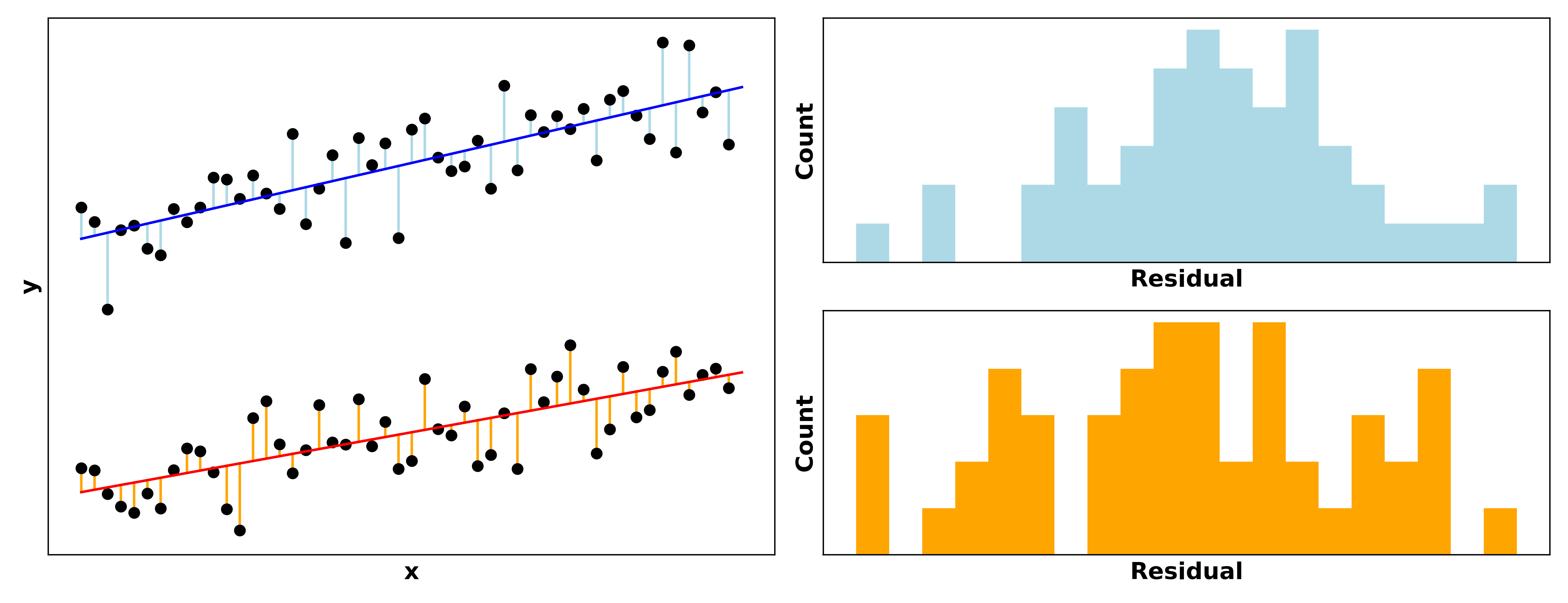
Much better!
p-values
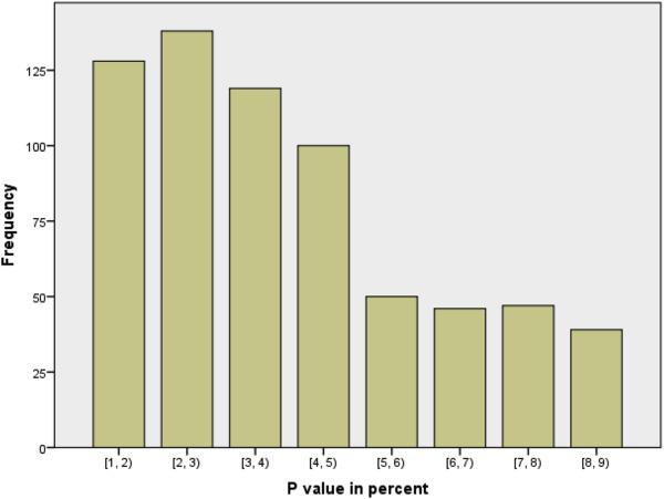
p-values are a can of worms. Given their status as the gatekeepers of significant results, there’s tremendous pressure for researchers to “hack” analyses such that their models output a value below 0.05, the generally-accepted threshold. The below figure from Perneger & Combescure 2017, for example, is a distribution of 667 reported p-values from four medical journals. Note the fascinating difference between p-values below 0.05 and those above…
But until everyone switches to Bayesian statistics, p-values are here to stay and you’ll need to understand them. The formal definition of a p-value is the probability of obtaining results at least as extreme as ours, assuming the null hypothesis is correct. Our null hypothesis is typically that the true effect size, difference in means between populations, correlation between variables, etc. is zero. p-values are the commonly-accepted method by which we say that the differences we’re observing are either:
- Large enough to reject the null hypothesis (meaning our observed patterns are statistically significant)
- Not large enough to reject the null hypothesis (meaning our observed patterns are just noise).
Note the careful wording there. There’s a sort of humility you need to adopt with statistics; the conclusions from our current data are our best guess at what the broader population looks like, but maybe that guess will be proven wrong in the future when more data is available.
Even with a “significant” p-value, we may still be wrong! Our acceptance threshold is also our false positive rate. In other words, with a $p$ = 0.05 cutoff, 5% of significant results are expected to actually be false positives. If the output of your analyses are informing crucial decisions, I’d set the p-value threshold at 0.01 or even 0.001.
Going back to our “study and sleep” model, if we see that the p-value for $\beta_1$, our study coefficient, is 0.0008 while the p-value for $\beta_2$, our sleep coefficient, is 0.26, we would conclude that studying affects exam scores and sleep does not.
$R^2$
One final concept before we close out this massive post. R-squared is a valuable metric for determining whether our model is actually any good. In short, $R^2$ is the proportion of variation in our target variable explained by variation in our predictors. The metric ranges from 0 (our model explains literally nothing about our target) to 1 (we can perfectly predict our target).
The higher the $R^2$ the better… to a point. An $R^2$ of 0.8 for our “study and sleep” model would mean that study and sleep account for 80% of the variation in exam scores for the students in our dataset. Maybe an additional feature like whether they ate breakfast could bump up our $R^2$ to 0.85, meaning our model is a bit better at explaining variation in scores. Indeed, if we have a lot of features to choose from, we could conduct feature selection to determine which features are most predictive.
But once we start getting an $R^2$ greater than ~0.97, I’d bet we’re hitting one of the following issues:
- There are too many features in our model and the model is overfit to our data
- We have too little data to begin with
- Some feature(s) may be “peeking” at the target variable by being the target in another form (e.g. an engineered feature that included the target)
The real world is messy, and it’s hard to condense it down into a model. Unless we’re modeling the universe’s physical laws, there will always be variation we can’t account for in our model. Maybe a student’s pencil broke halfway through the exam and it threw them off their game. Maybe one student is actually an X-Man and could secretly read the answer key. This again reflects that humility we need to have when talking about statistics: our model is a best guess at explaining the real world.
Concluding thoughts
Phew, that was a whirlwind! To reiterate from earlier, it’s challenging to write out the statistics useful for data science without writing a massive textbook… but we can at least write a massive blog post.
Stats is a series of tools for parsing signals from noise in our data, and the more tools you have, the more types of problems you can handle. But of course, with so much stats out there, we need to choose what to learn first. This post has focused on giving you the fundamentals rather than the latest cutting-edge libraries, as the fundamentals tend not to change much, and the advanced topics build on the core concepts. Understand these really well, and the rest will come naturally.
In the next post, we’ll be covering skills for manipulating and analyzing data. See you there!
Best,
Matt
Footnotes
1. Wait, do I actually need to learn stats?
The Apollo Guidance Computer had 4.096 KB of RAM. An average laptop in 2020 has 8 GB, which is 1.95 million times more powerful. If we use a memory-optimized AWS EC2 instance, we have access to upwards of 1.57 billion times more compute than the Apollo mission. And all to identify pictures of cats…
2. Wait, do I actually need to learn stats?
Rather than removing the need for statistics, big data exacerbates common statistical risks. I’ve linked some further reading below.
- American Statistical Association: Statistics and Big Data
- National Science Review: Challenges of Big Data Analysis
3. Ok, so how much stats do I actually need?
If people come to you for help making crucial decisions from data, you’ll want to account for statistical nuances like random effects, regression discontinuities, nonparametric or Bayesian alternatives to frequentism, bootstrapping and more.
4. Ok, so how much stats do I actually need?
While writing this post, I kept imagining stats gurus criticizing an omission here, or going into too little detail there. After weeks of writing, I’ve decided to not dive into AIC, clustering, distributions besides the Gaussian, and a few other topics. We have to stop somewhere! I’m just calling this is a non-exhaustive list. Consider it a starting point; add to your repertoire as needed!
5. Control groups
You can easily see this effect for yourself in R or Python. (I use R below.) Note: it’s critical to set g2 equal to g1 shifted upward, rather than just another rnorm with a higher mean, since the paired t-test looks closely at the pairwise differences between each element in the vector. The paired t-test will likely return a weaker result than a two-sample test if g1 and g2 are unrelated samples, since the distribution of g1 - g2 straddles zero. And an obligatory note after the #pruittgate fiasco… never fabricate data in scientific studies!! The intention of these demos is strictly to better understand how statistical tests work, not to game a system.
| R |
1
2
3
4
5
6
7
8
9
10
11
12
13
14
15
16
17
18
19
20
21
22
# Generate sample data
set.seed(0)
g1 <- rnorm(10, 0, 1)

set.seed(0)
g2 <- g1 + rnorm(10, 0.5, 0.25)  # shift g2 upward

# Run t-tests
mod1 <- t.test(g1, g2)
mod2 <- t.test(g1, g2, paired=T)

# Unpaired is not significant; paired is significant
mod1[['p.value']]  # 0.3472
mod2[['p.value']]  # 0.0002

# Unpaired t-value is small; paired is larger
mod1[['statistic']][['t']]  # -0.967
mod2[['statistic']][['t']]  # -6.189

# Unpaired confidence interval is large; paired is narrower
diff(mod1[['conf.int']])  # 2.573
diff(mod2[['conf.int']])  # 0.431
6. Regression
If you look closely (or have taken enough statistics to use linear algebra), you might notice that $ h(x) = \sum_{j=0}^{n}\beta_jx_j $ expects a $x_0$ to accompany $\beta_0$, but there’s no $x_0$ in the equation for our example model $h(x) = \beta_0 + \beta_1x_1 + \beta_2x_2$. This reflects a difference in whether or not we’re using matrix multiplication to generate our predictions. A necessary pre-processing step for using linear algebra is to add a column of 1’s for $x_0$ to our feature matrix; otherwise, there’s a mismatch between the number of features ($n$) and the number of coefficients ($n+1$). Because $x_0$ is always 1 and is just a bookkeeping step, it’s usually omitted from the equation when you expand it out.
7. Regression
There is one important caveat to mention here regarding the ease of understanding a regression model’s coefficients. Yes, they do show the influence each input variable has on the output, but these coefficients are affected by all other variables in the model.
In our “study and sleep” exam model, for example, removing “hours studied” from our model will cause the “sleep” coefficient to skyrocket, since it’s now entirely responsible for converting “hours slept” into an exam score.
You’ll find that variables’ coefficients can shrink, explode, or even change sign when you add or remove predictors and rerun the model. Trying to understand these changes is where you need a deep understanding of your data.
8. Classification
Note that the concept of “success” versus “failure” is completely arbitrary. If in our data 1 corresponds to passing the exam and 0 for failing, our “success” is passing the exam, and our model outputs probabilities of passing, given our predictors.
But if we flip the 1’s and 0’s, then our “success” becomes failing the exam, and our model just outputs probabilities of failing rather than passing.
9. Residuals
The “distance between actual versus predicted” for classification models is simpler $-$ the only options are whether the classification was correct or incorrect, even for multi-class classification. A great measure of accuracy for classification models is the confusion matrix, which provides a ton of info about your model’s accuracy, its false positive and false negative rates, etc.
10. Residuals
I talk about minimizing residuals at great length in this blog post, where I recreate R’s linear regression function by hand. Check it out if you’re looking for a deep dive into how coefficients are determined for linear regression models.